// Boehringer Ingelheim.
Spatial Brand Experience.
1. Logo ID Legibility Exploration.
Exploration of legibility through contrasting returns relating to brand colours.

Dark Green Front & Returns
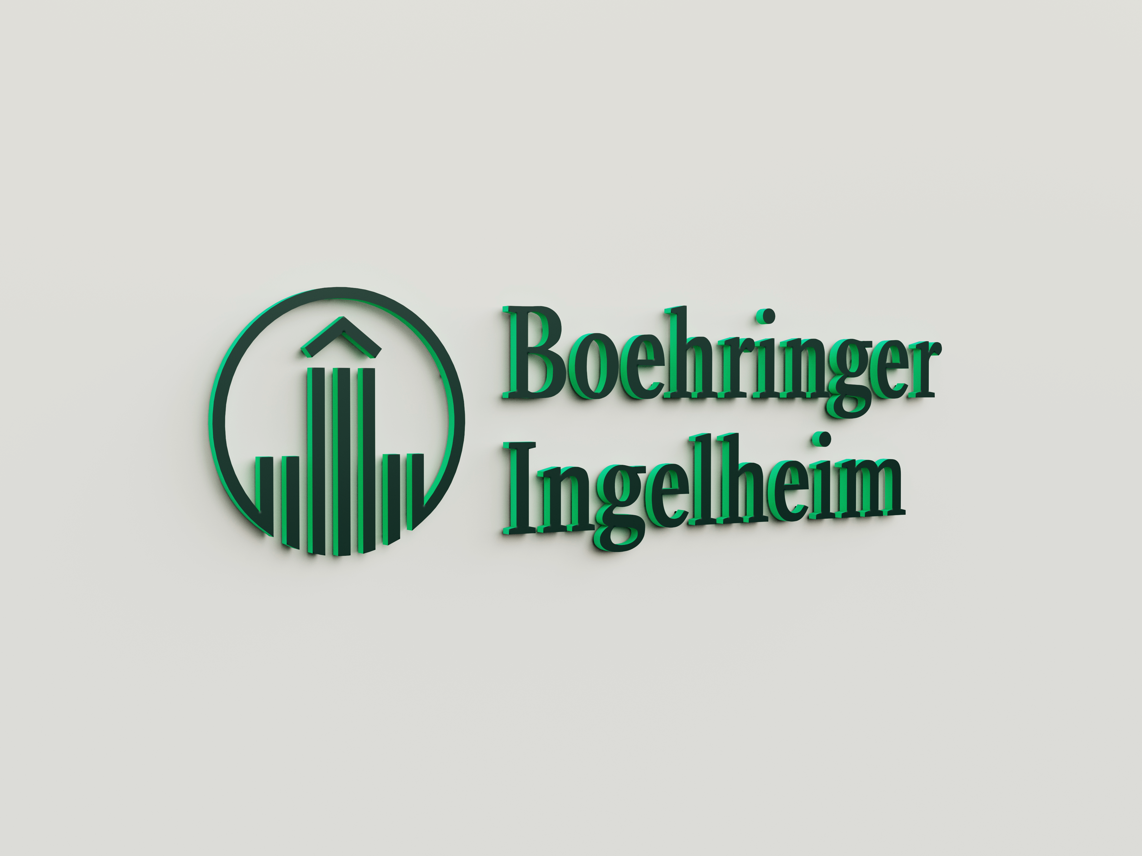
Dark Green Front & Accent Green Returns
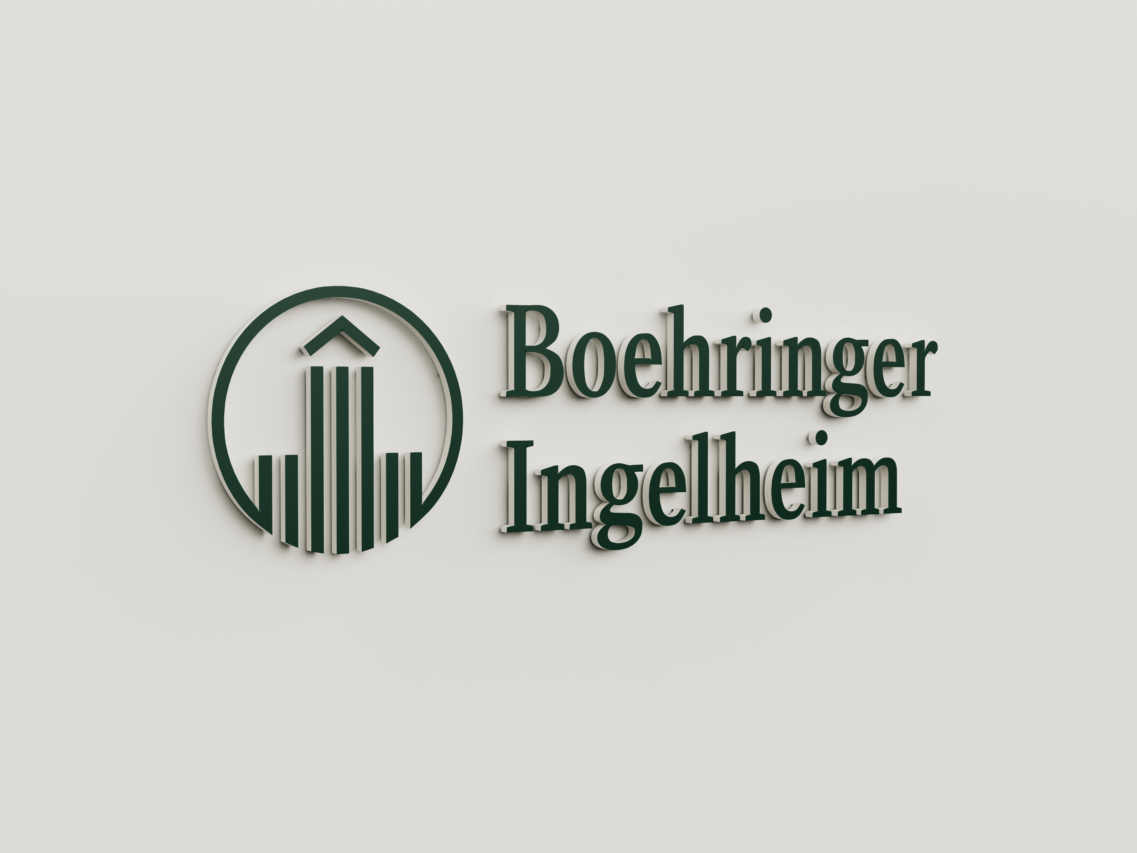
Dark Green Front & White Returns

White Front & Dark Green Returns

White Front & White Returns

Dark Green Front & Tint Returns
2. Logo ID Lighting Variations.
Exploration of various lighting types: face illumination, halo illumination and return illumination for night time settings.

White Front & Halo Illumination
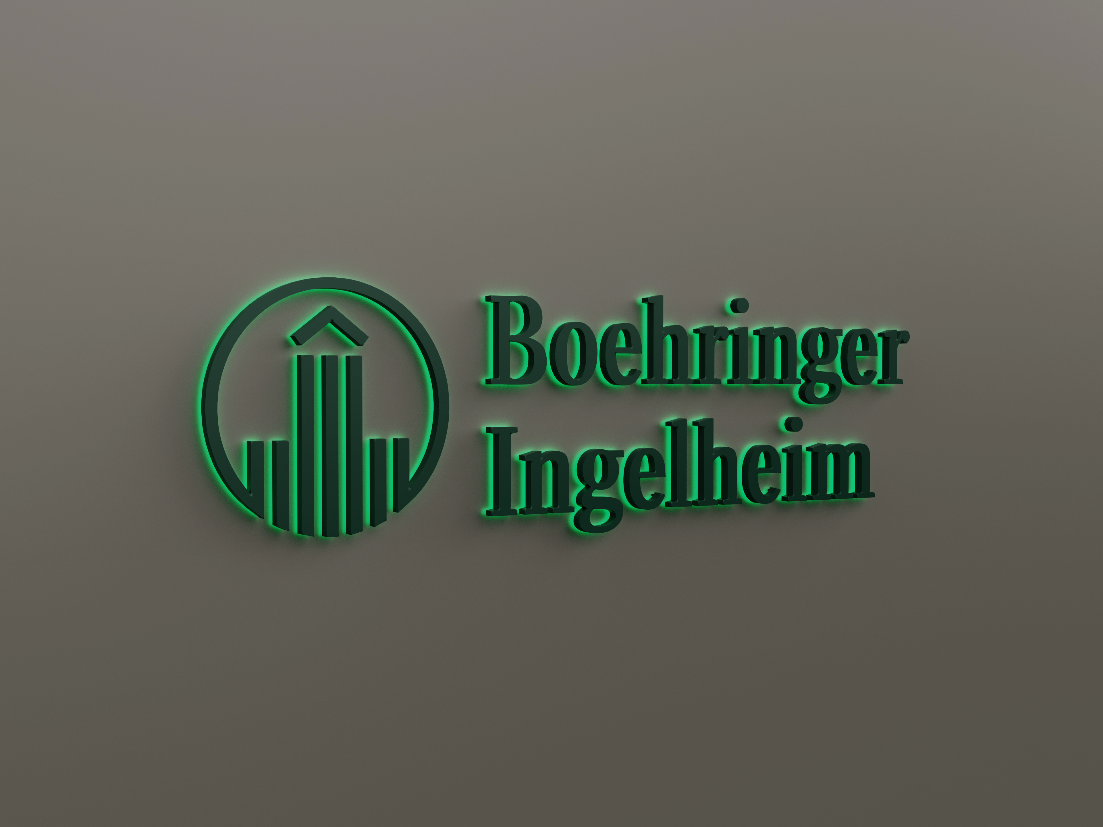
Accent Green Halo Illumination

Accent Green Front Illumination
3. Logo ID "Fun" & Seasonal Lighting Exploration.
Animating the logo through the use of colour and light in addition to an LED Curtain for a “fun” experience and for seasonal events such as Christmas.

Animated Face Illumination
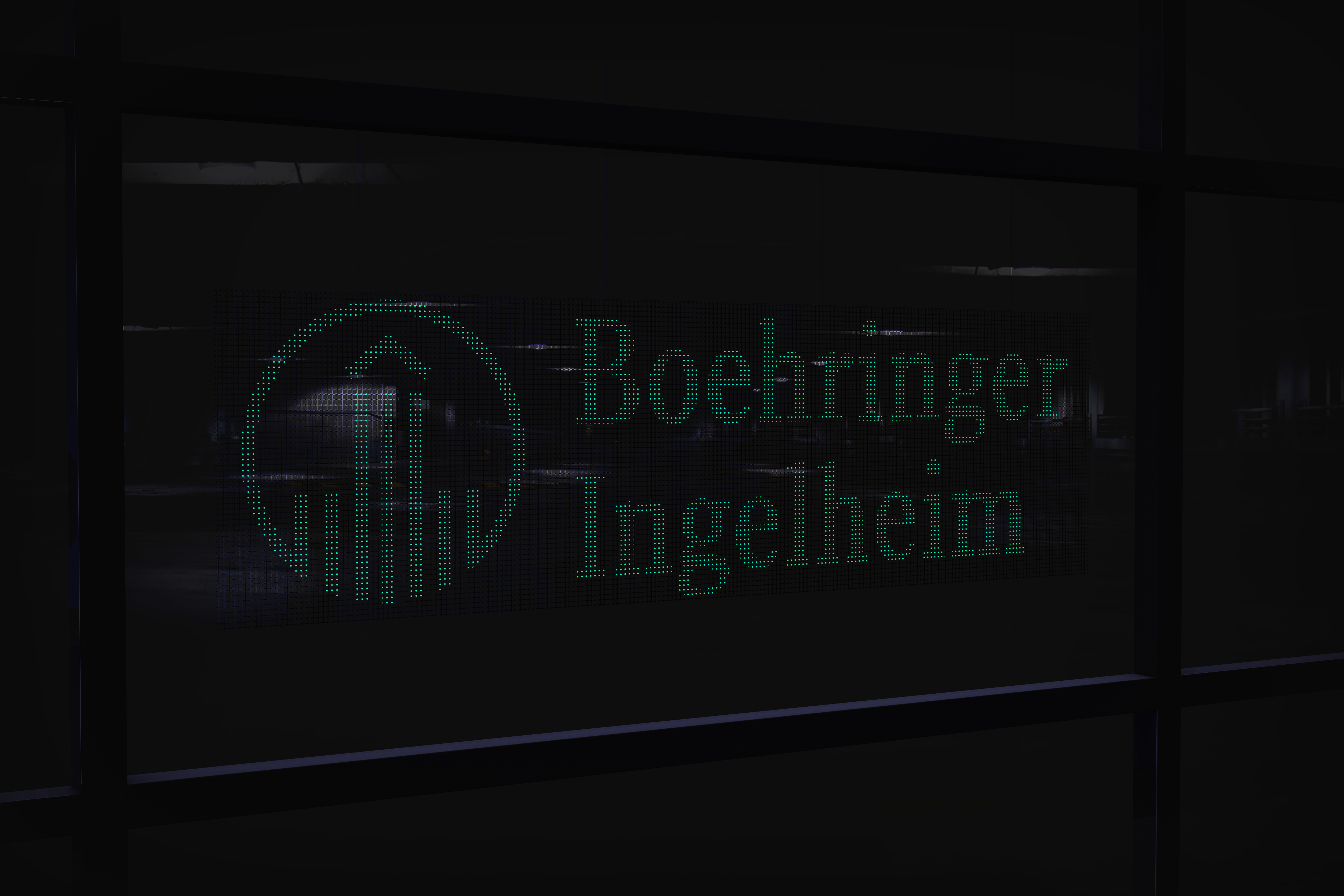
LED Curtain Illumination
Seasonal Illumination
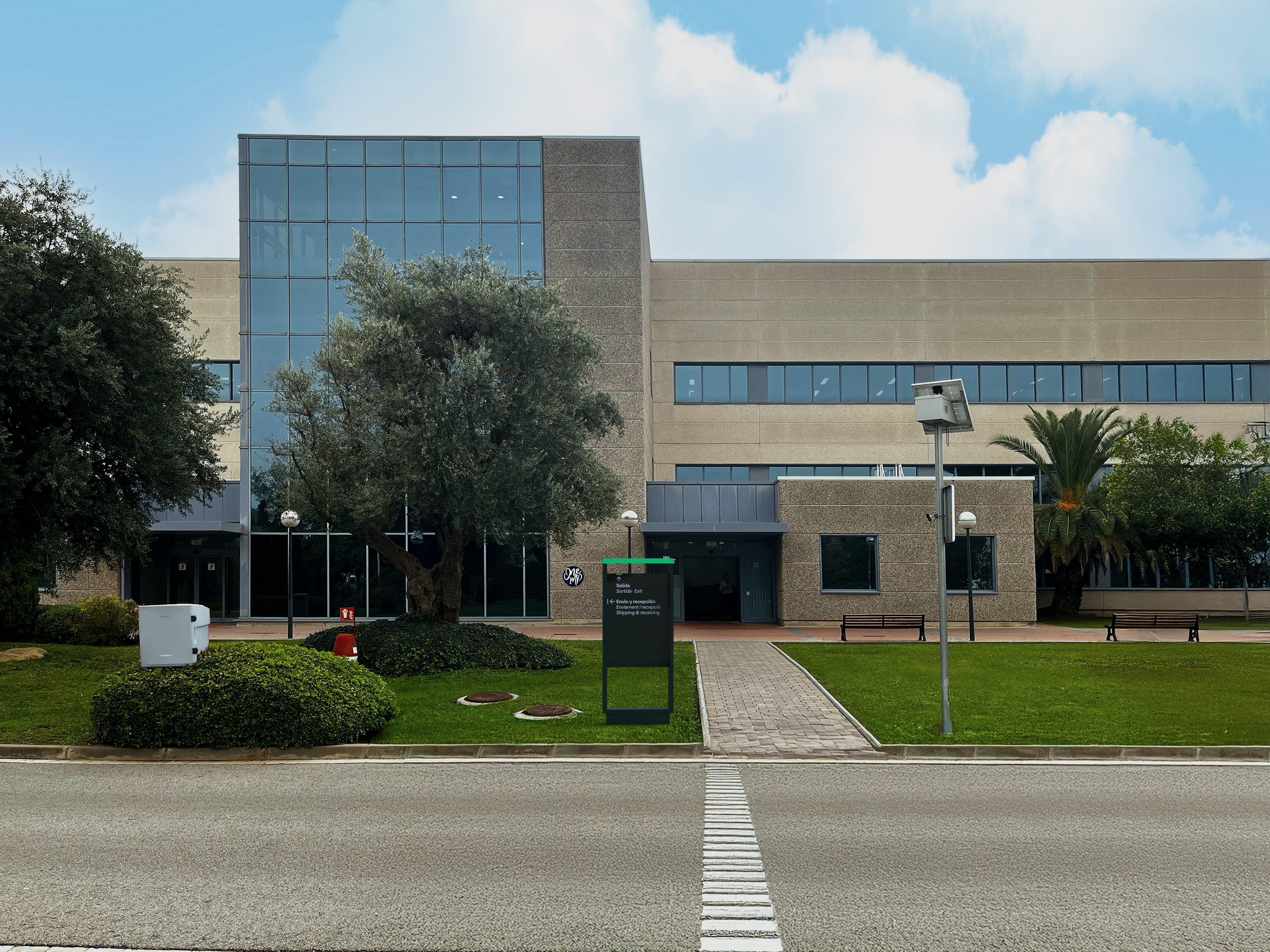
5. Signage Renders.
Various “in a void” renders of signage (from left to right): a Lectern, a Freestanding Site ID, a Monolith, a Freestanding Gate ID and Suspended.
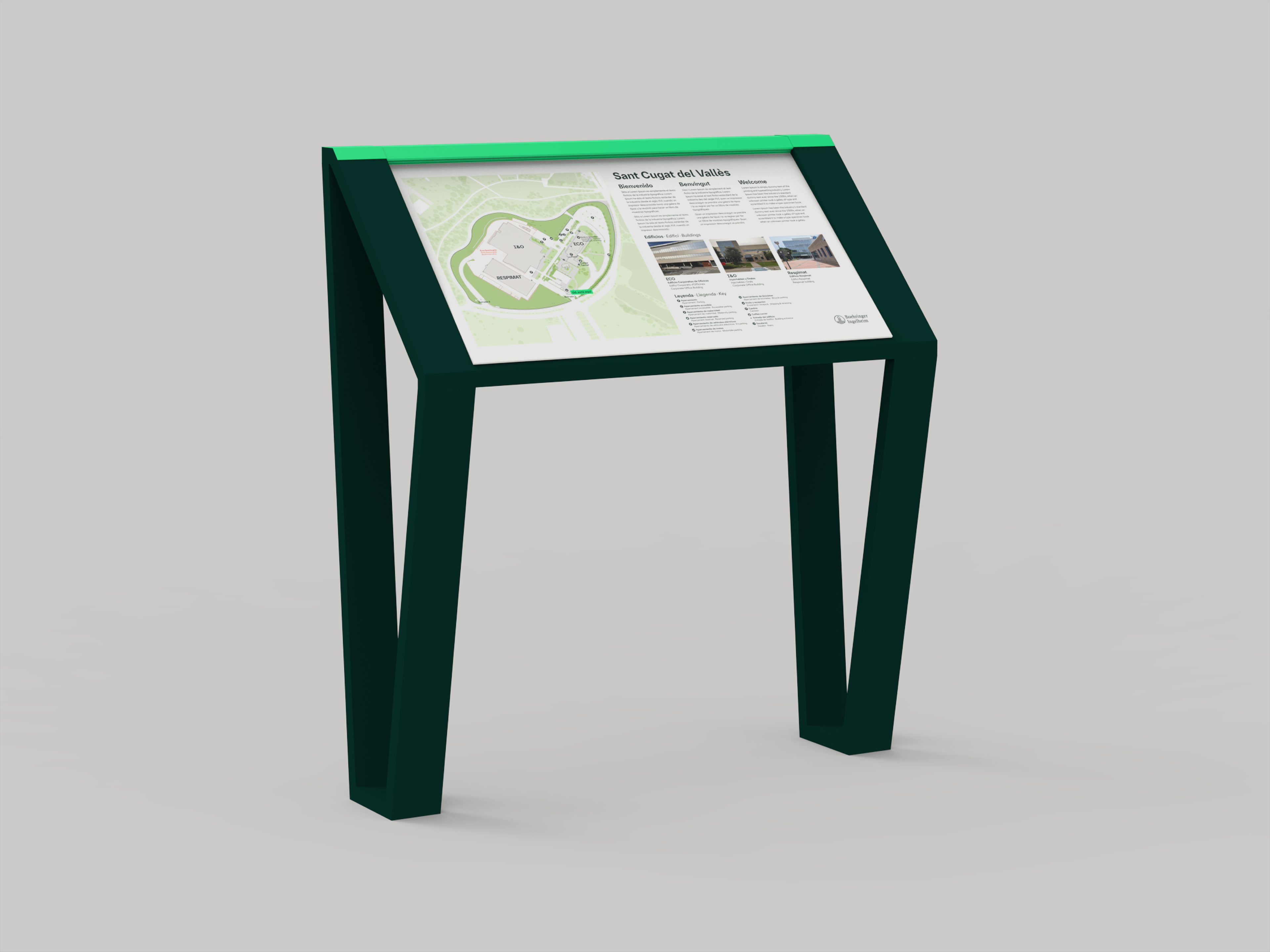
Site Orientational Lecturn

Freestanding Site ID

Site Orientational Monolith
Suspended Directional
Wall-Mounted Directional
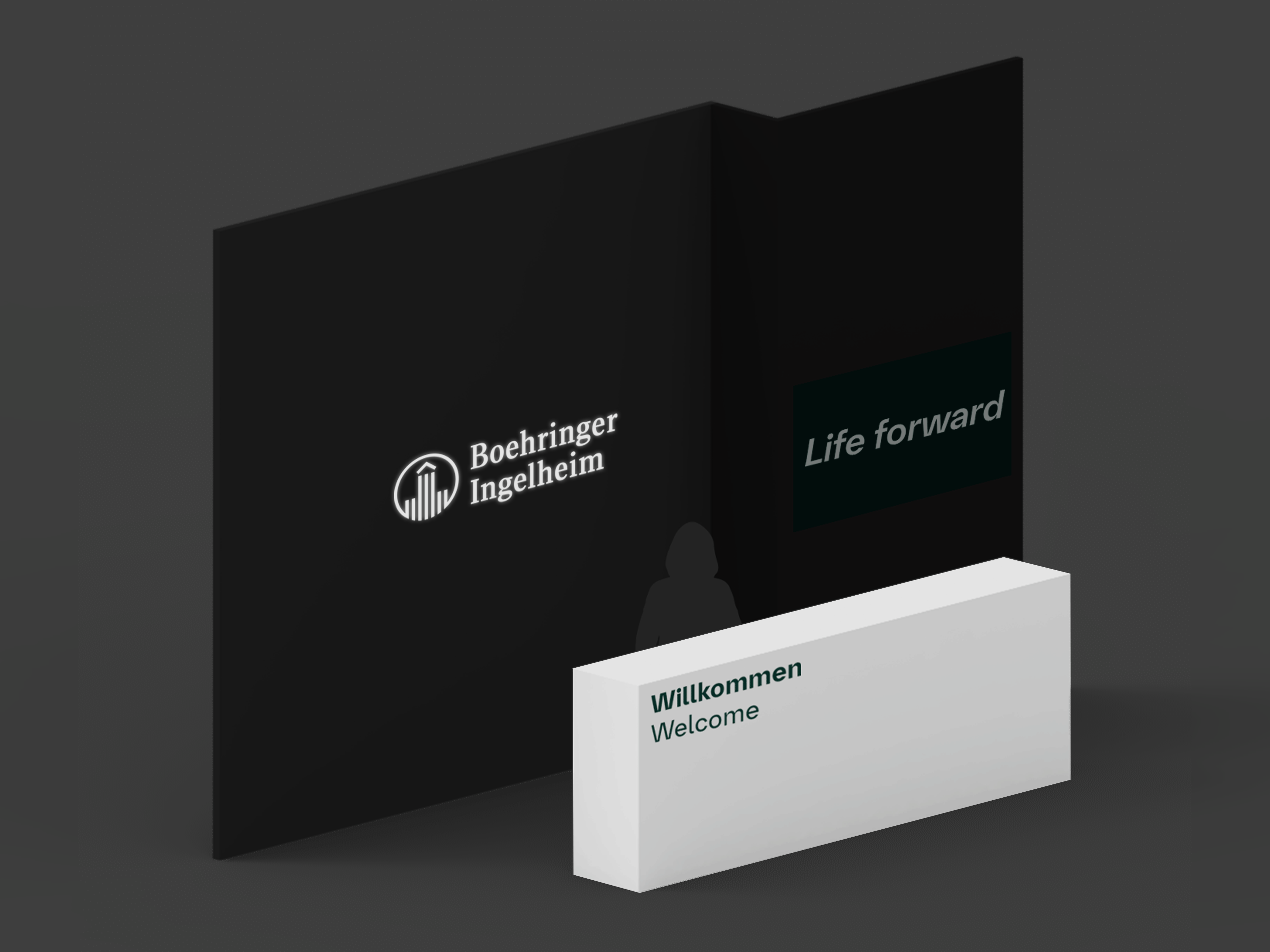
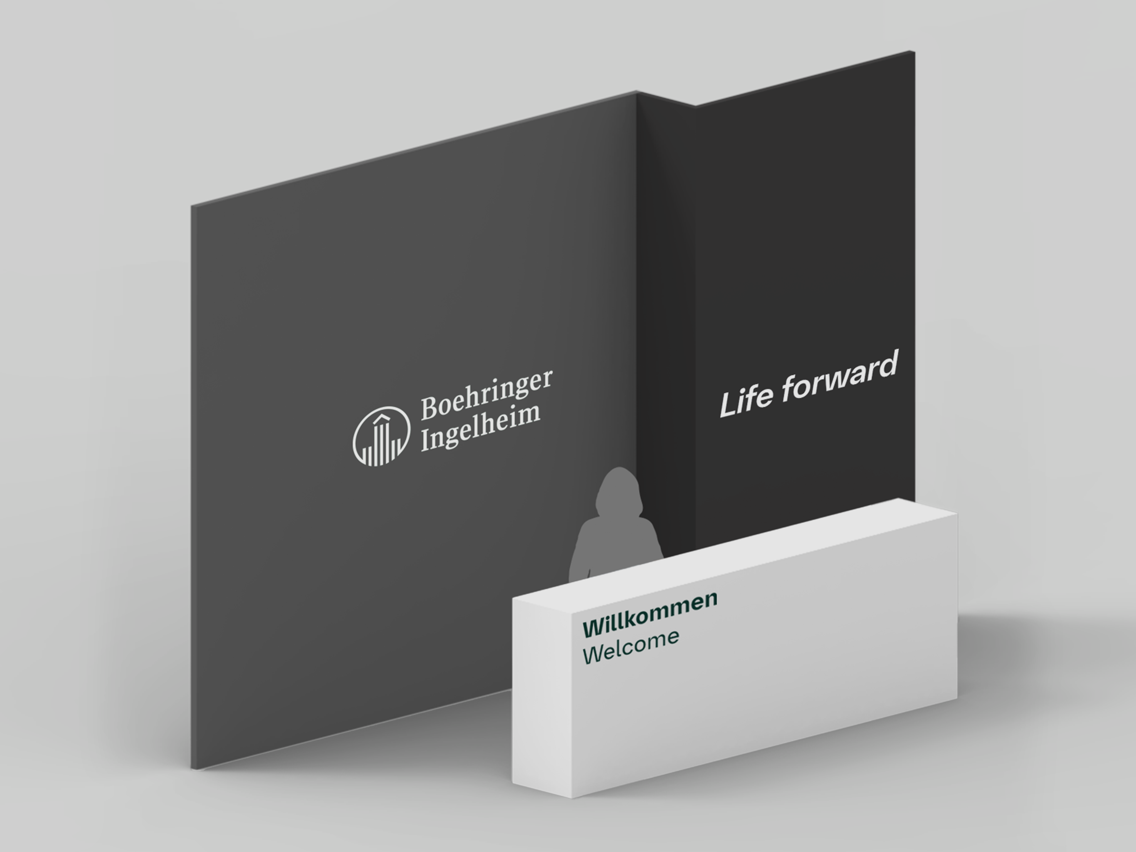
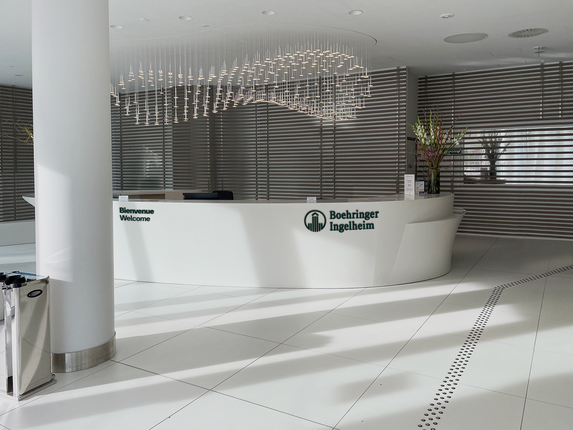
6. Brand Element Reception Exploration.
Exploration of how various brand elements (Logo, Claim, Welcome) should come together in reception spaces.
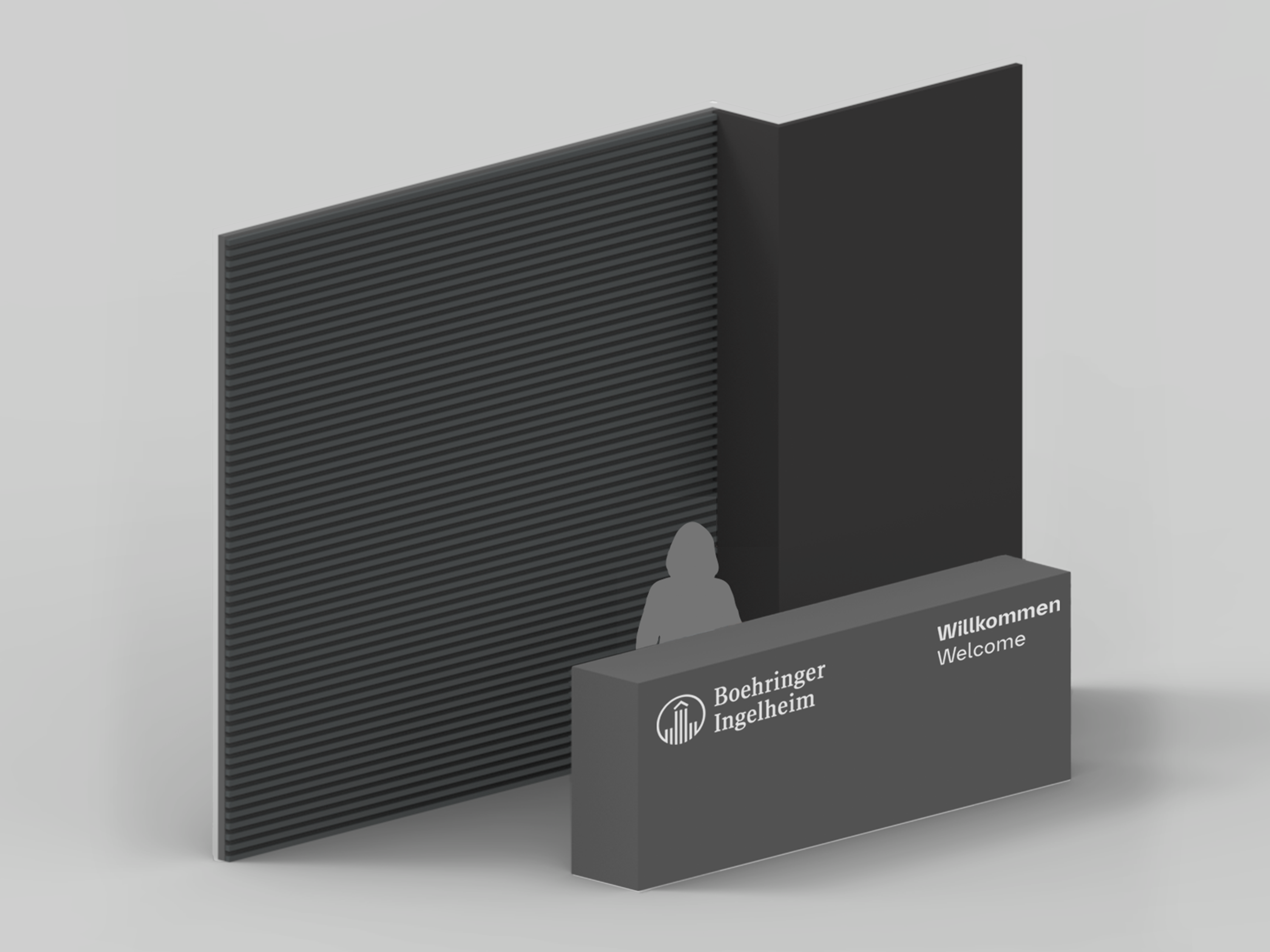
Logo & Welcome on Desk

Logo & Claim on Wall
Logo, Claim & Welcome Dark
Reception ID
Logo, Claim & Welcome Mixed

Logo, Claim & Welcome Light
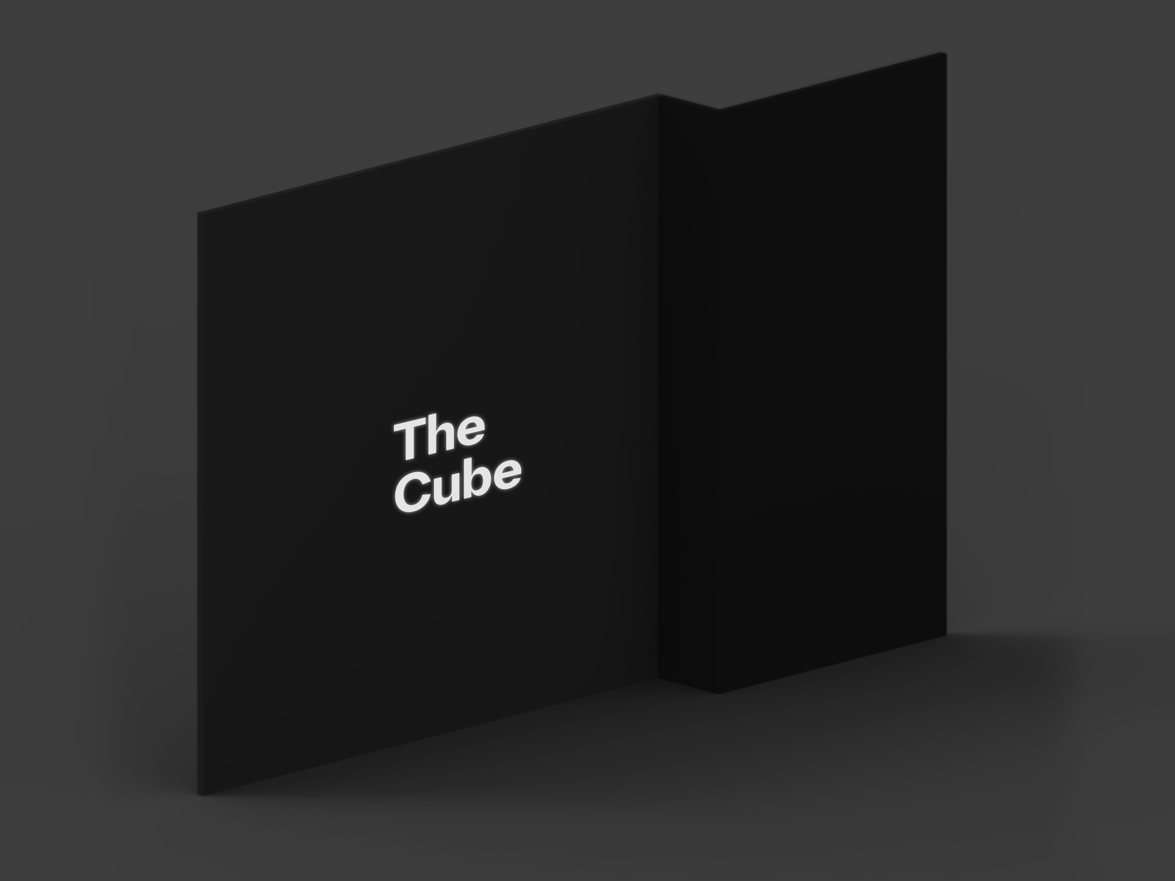
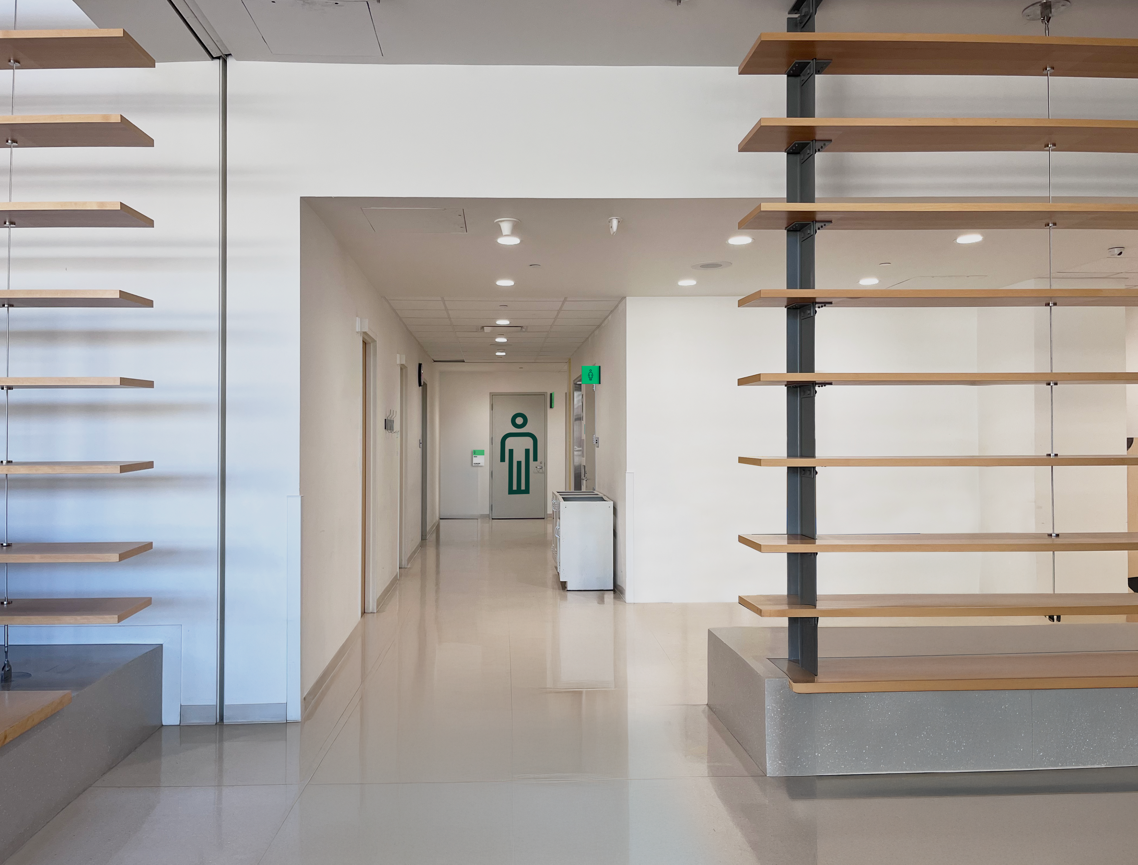
7. Interior Signage Visualisations.
In-situ visualisations of interior signage, including wall graphics, fins, blades and receptions IDs.
Reception ID
Graphic, Ledge & Fin ID
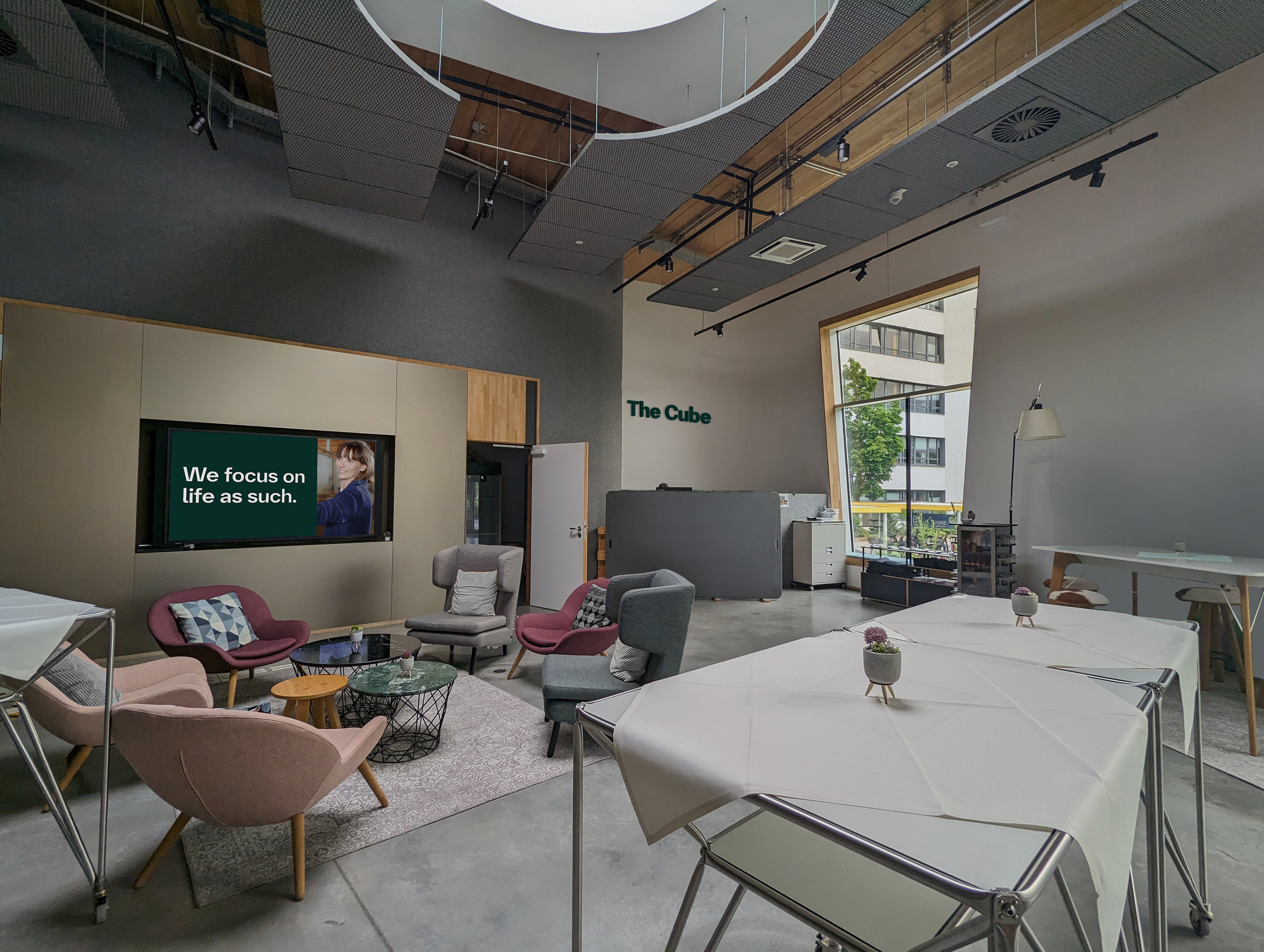
The Cube Reception ID
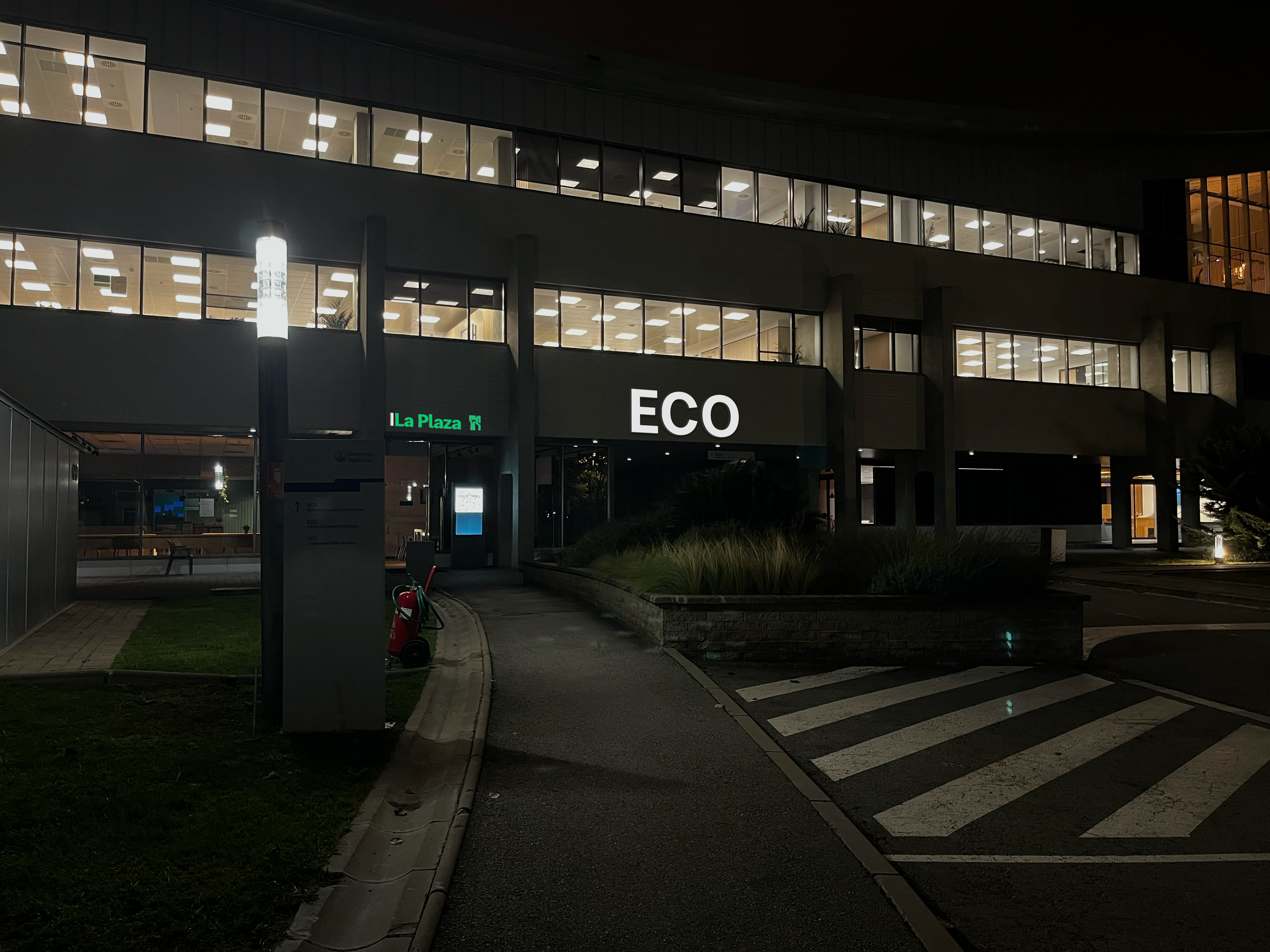
8. Exterior Signage Visualisations.
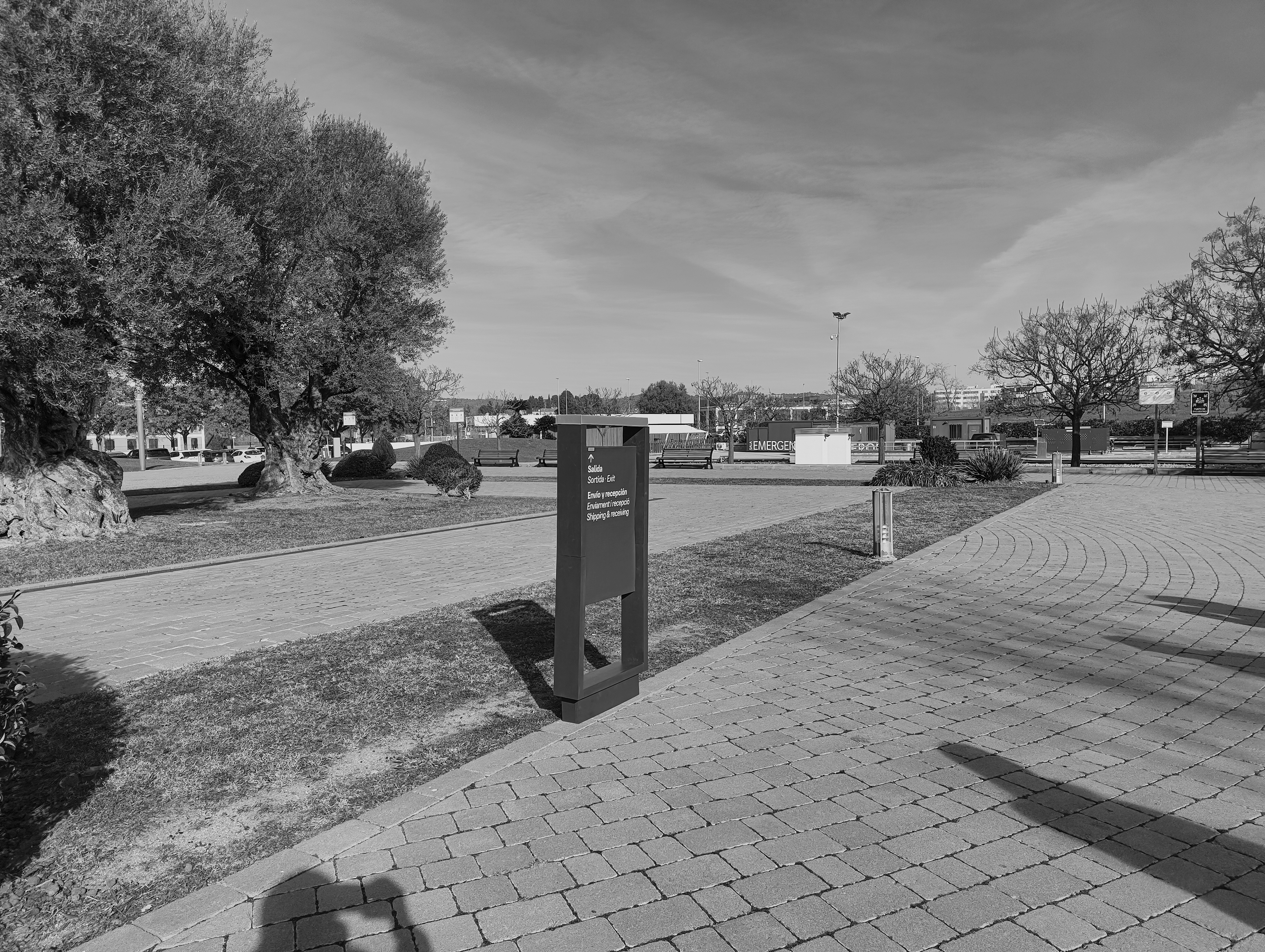
In-site visualisations of exterior signage, including building and facility IDs and various freestanding signs.
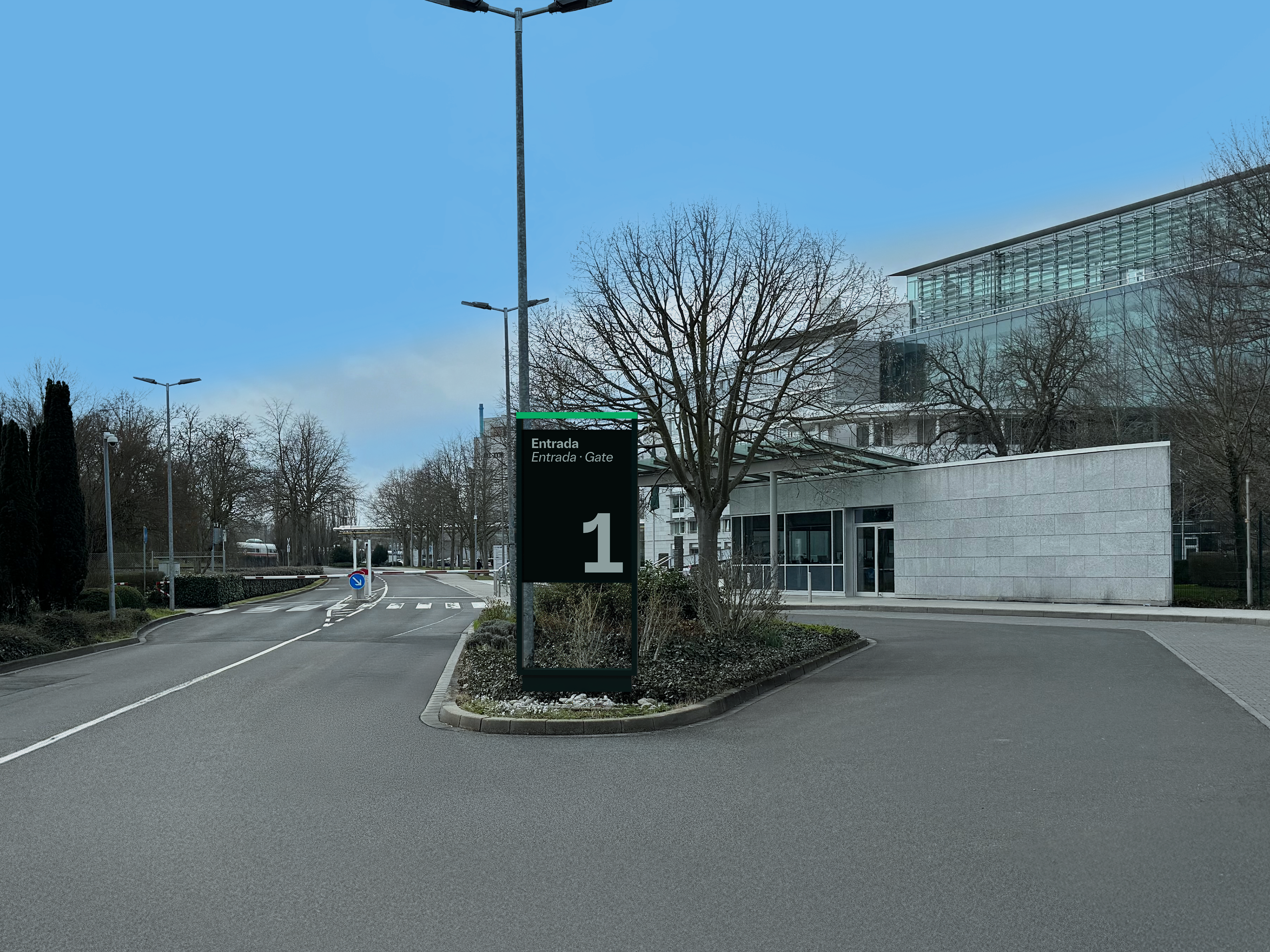
Gate ID
Directional Nudge
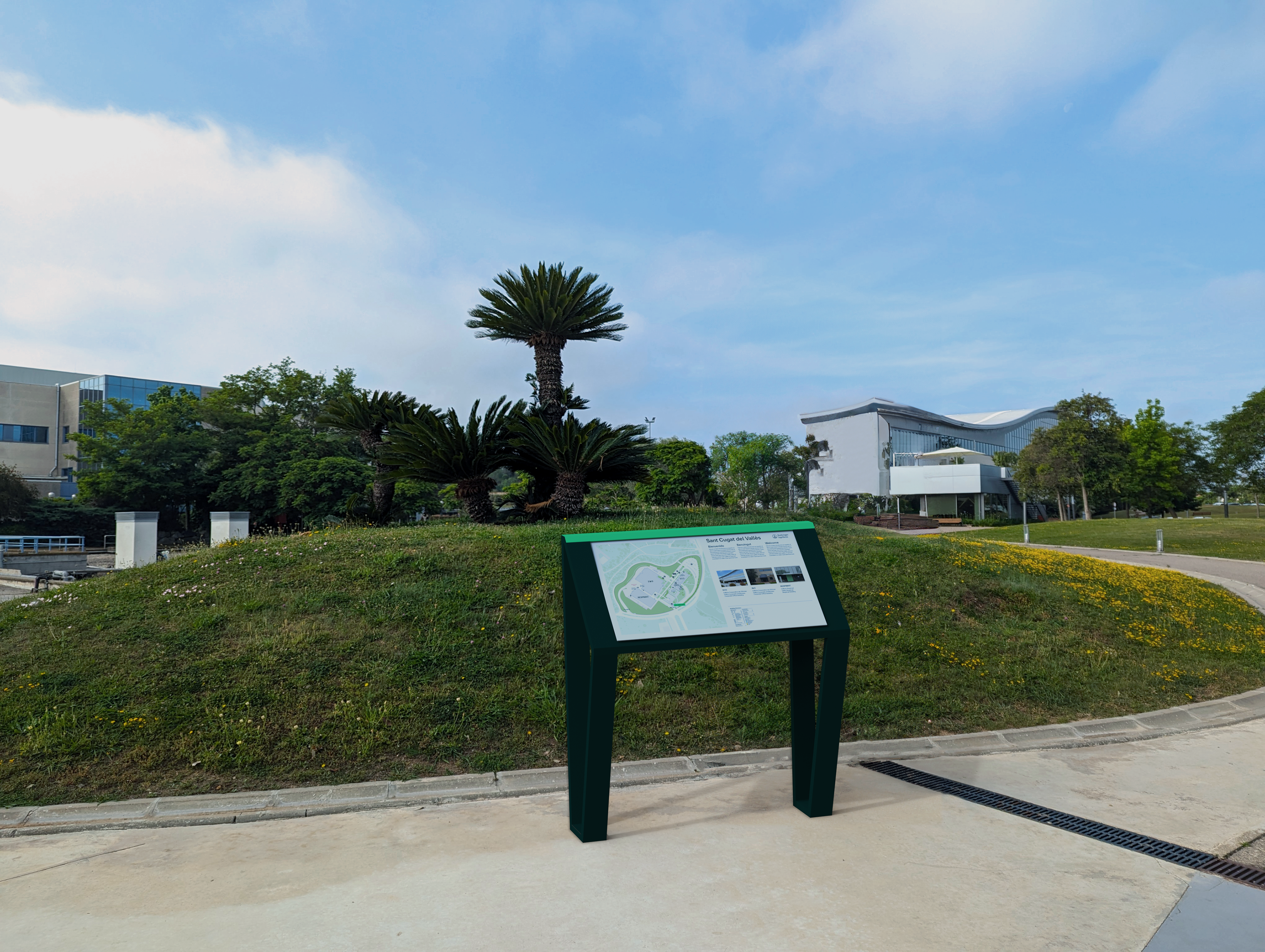
Orientational Lecturn

Orientational Monolith
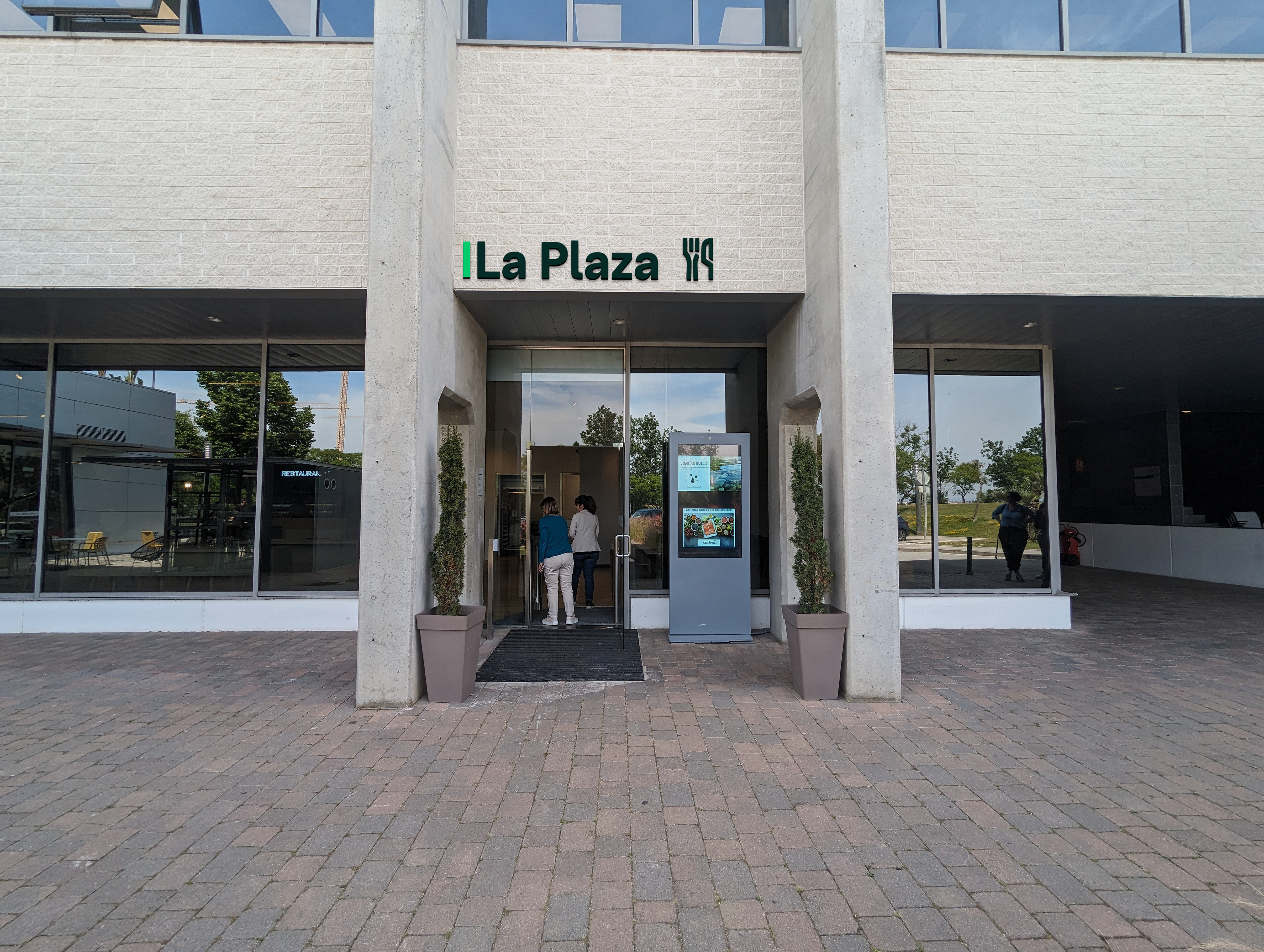
La Plaza Amenity ID
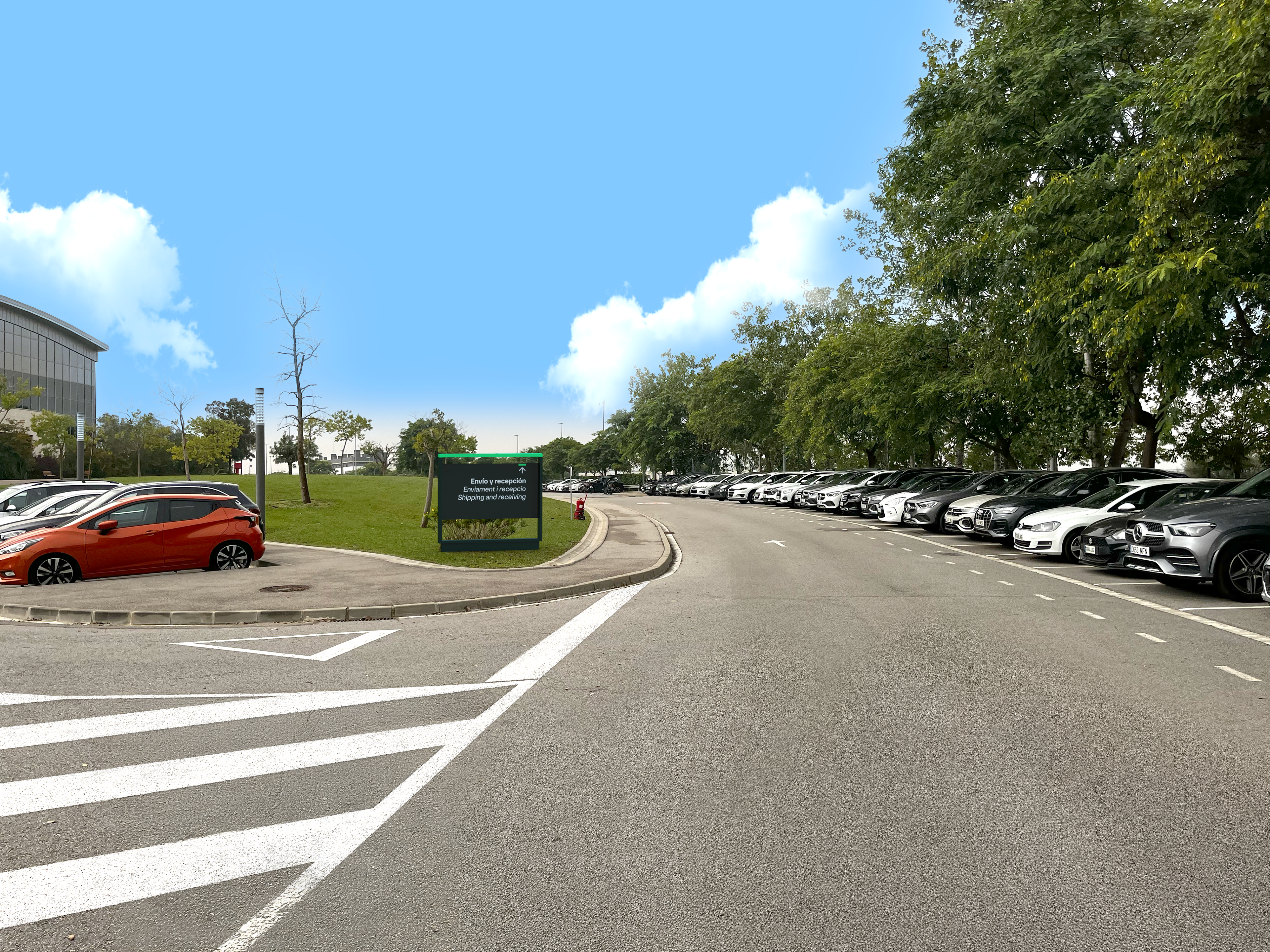
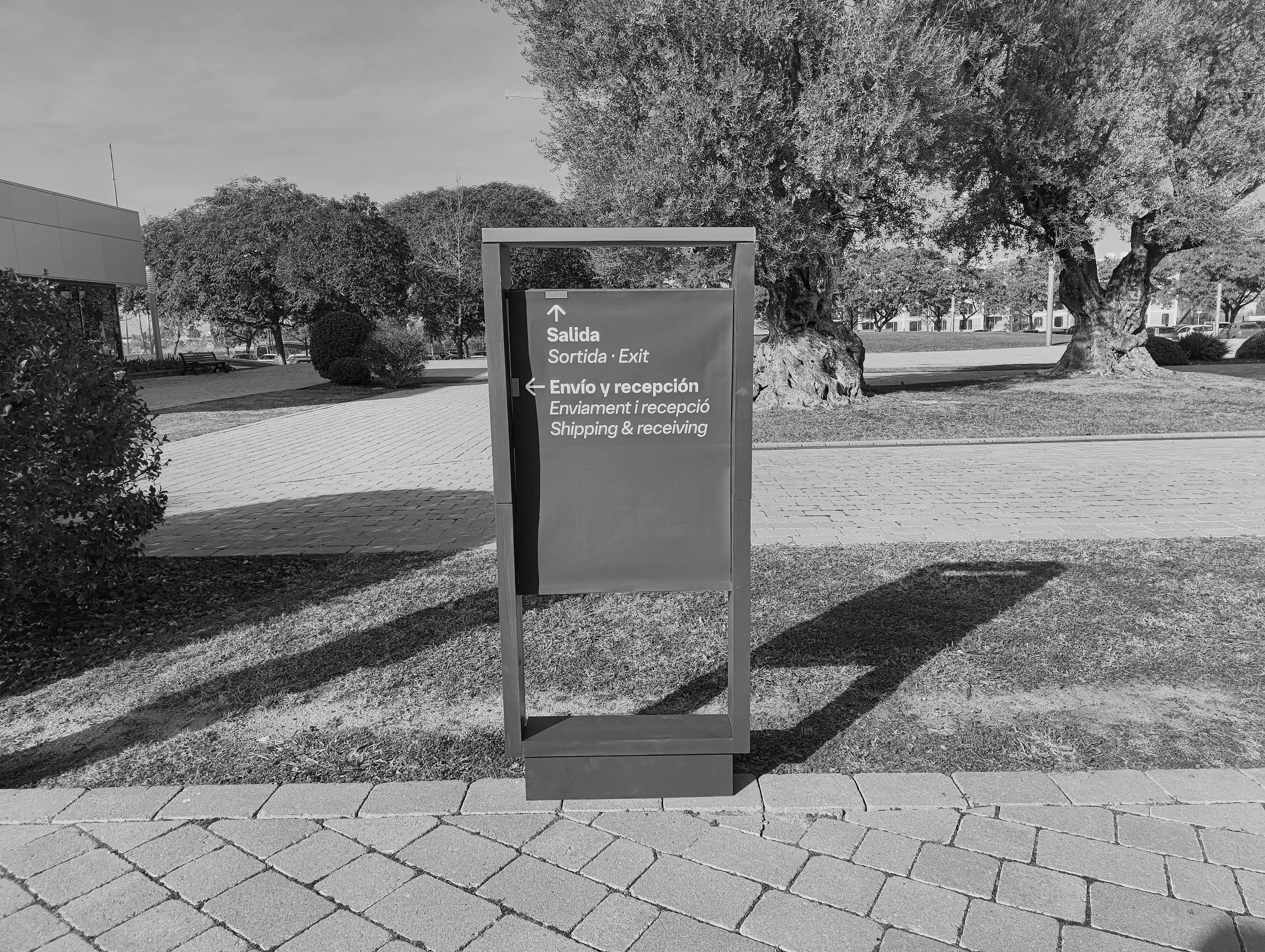
Envio Amenity ID

Respimat Building ID
Vehicular Directional Nudge
Logo Building ID
9. Prototypes & On-site Testing.
The prototyping process and in-situ testing through use of materials such as foamboard, card and printed graphics.
Early Sketch Exploration
Nudge Model Front-View

Nudge Model Close-up
Nudge Model Side-View
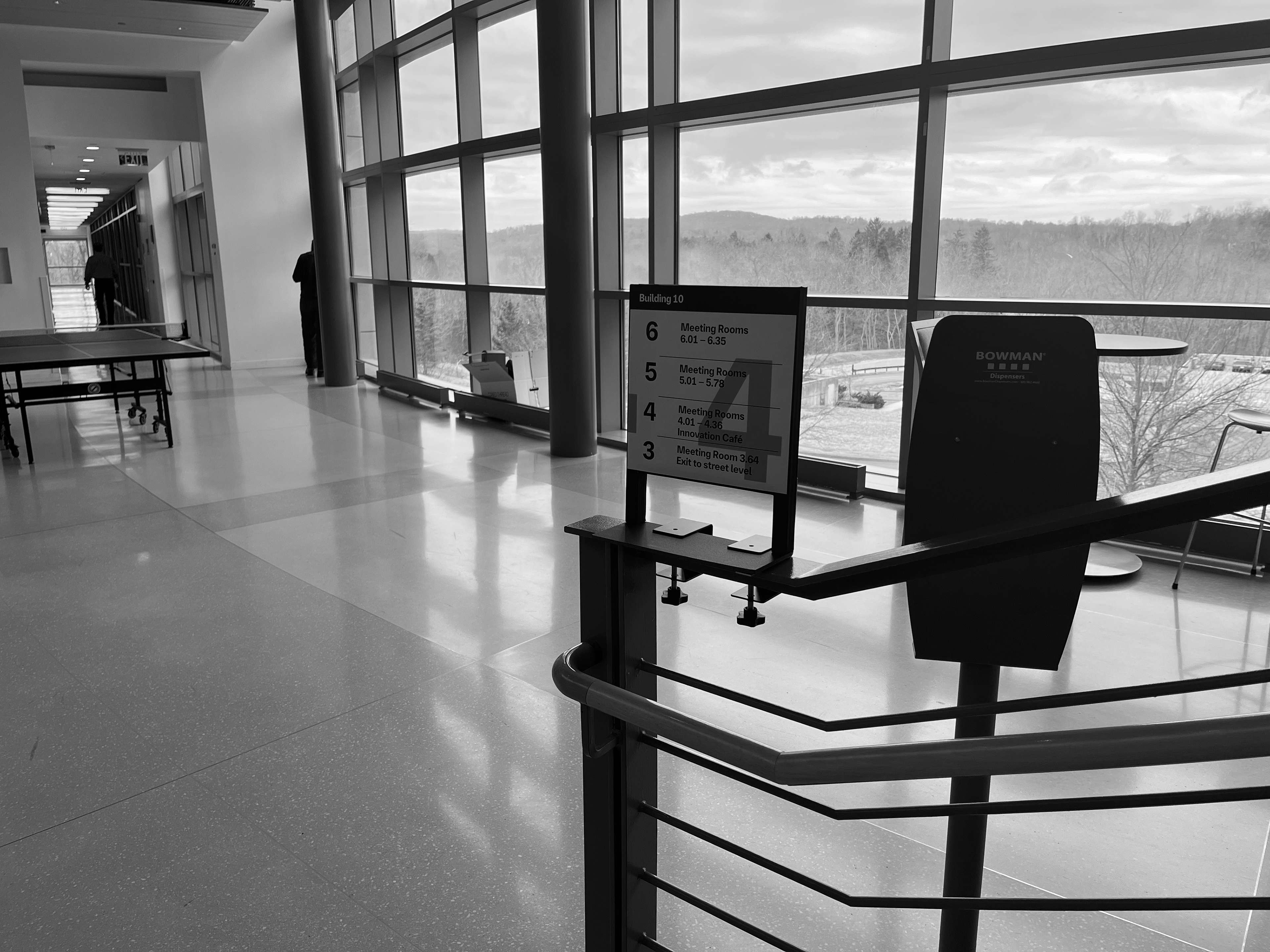
Level Directory In-Situ
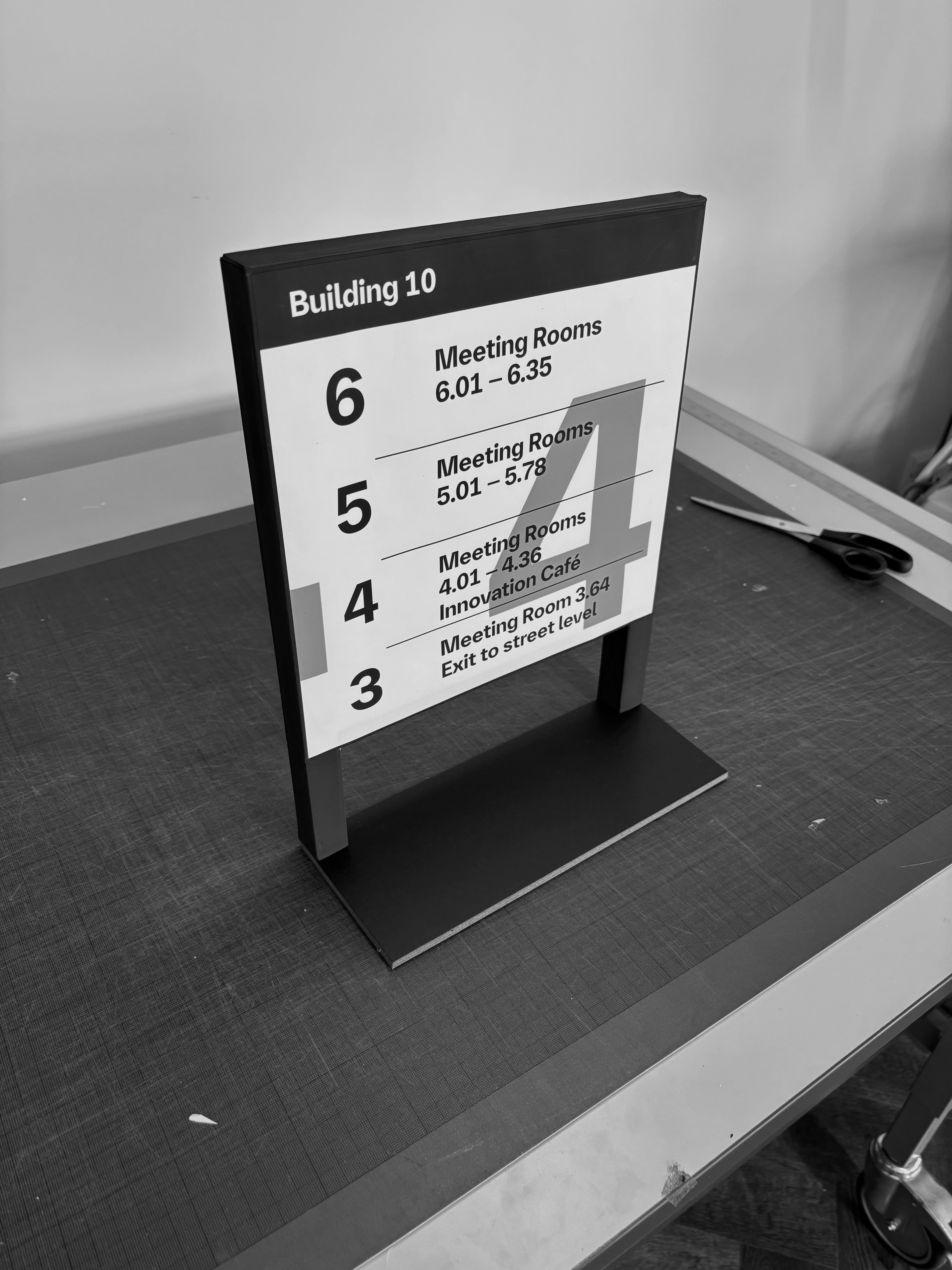
Completed Prototype

Paper & Foamboard Construction
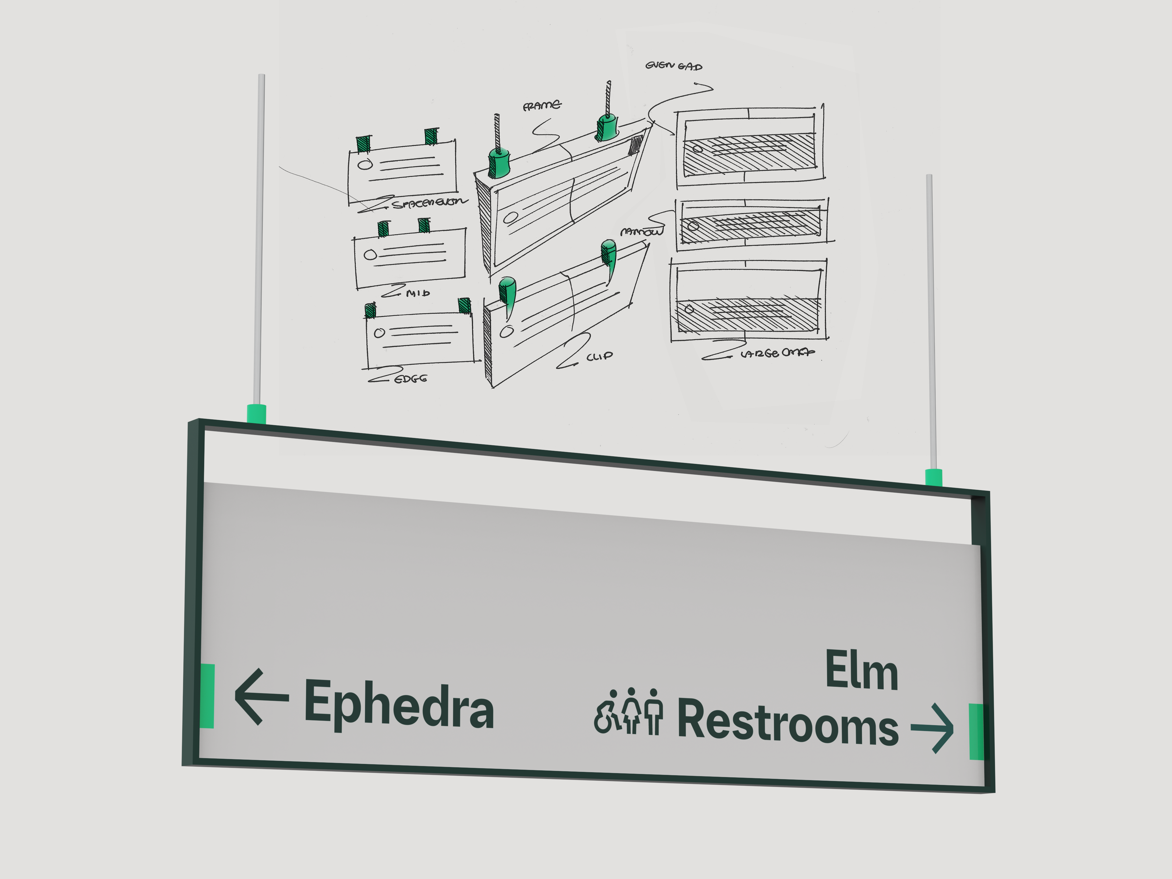
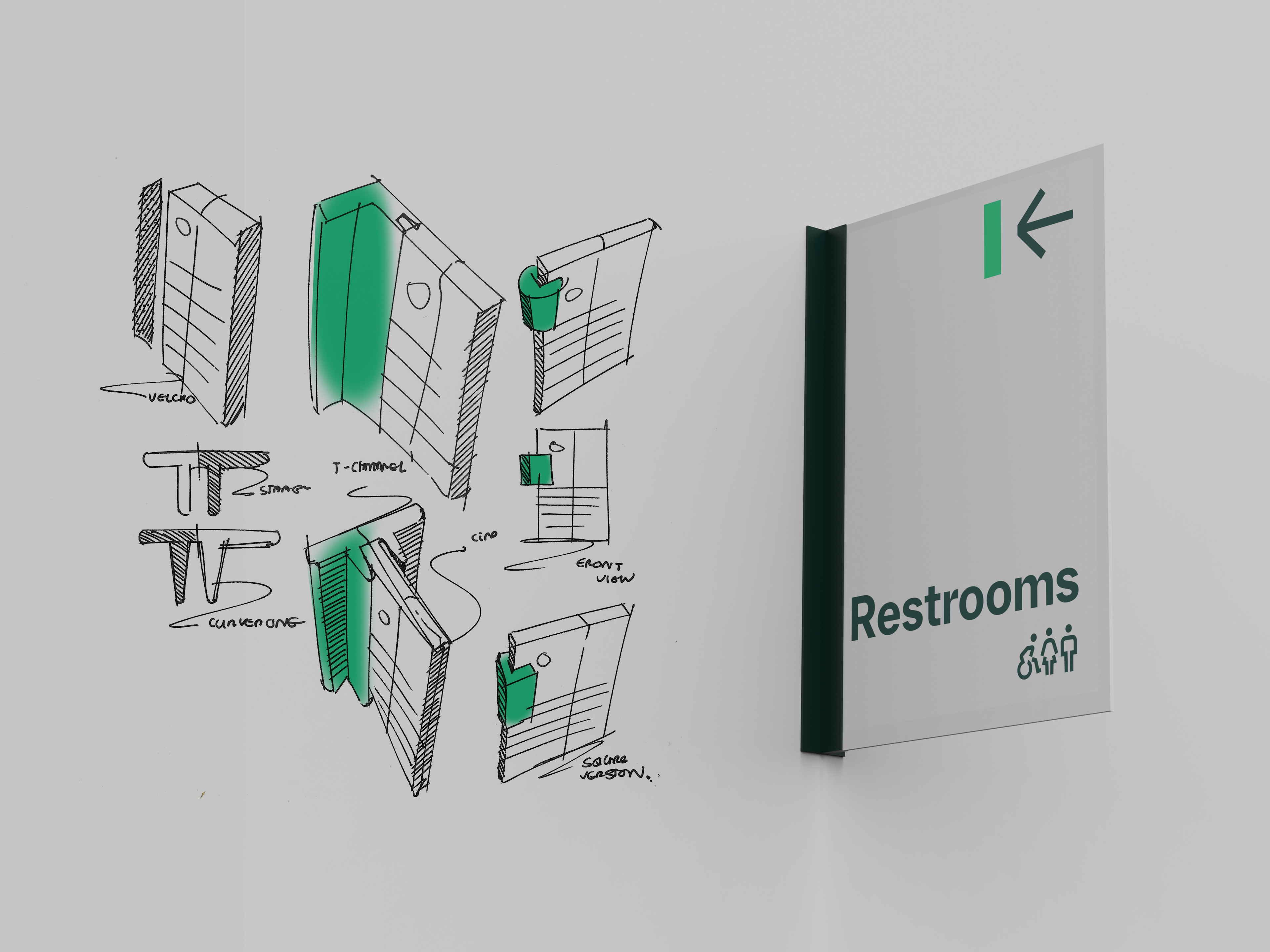
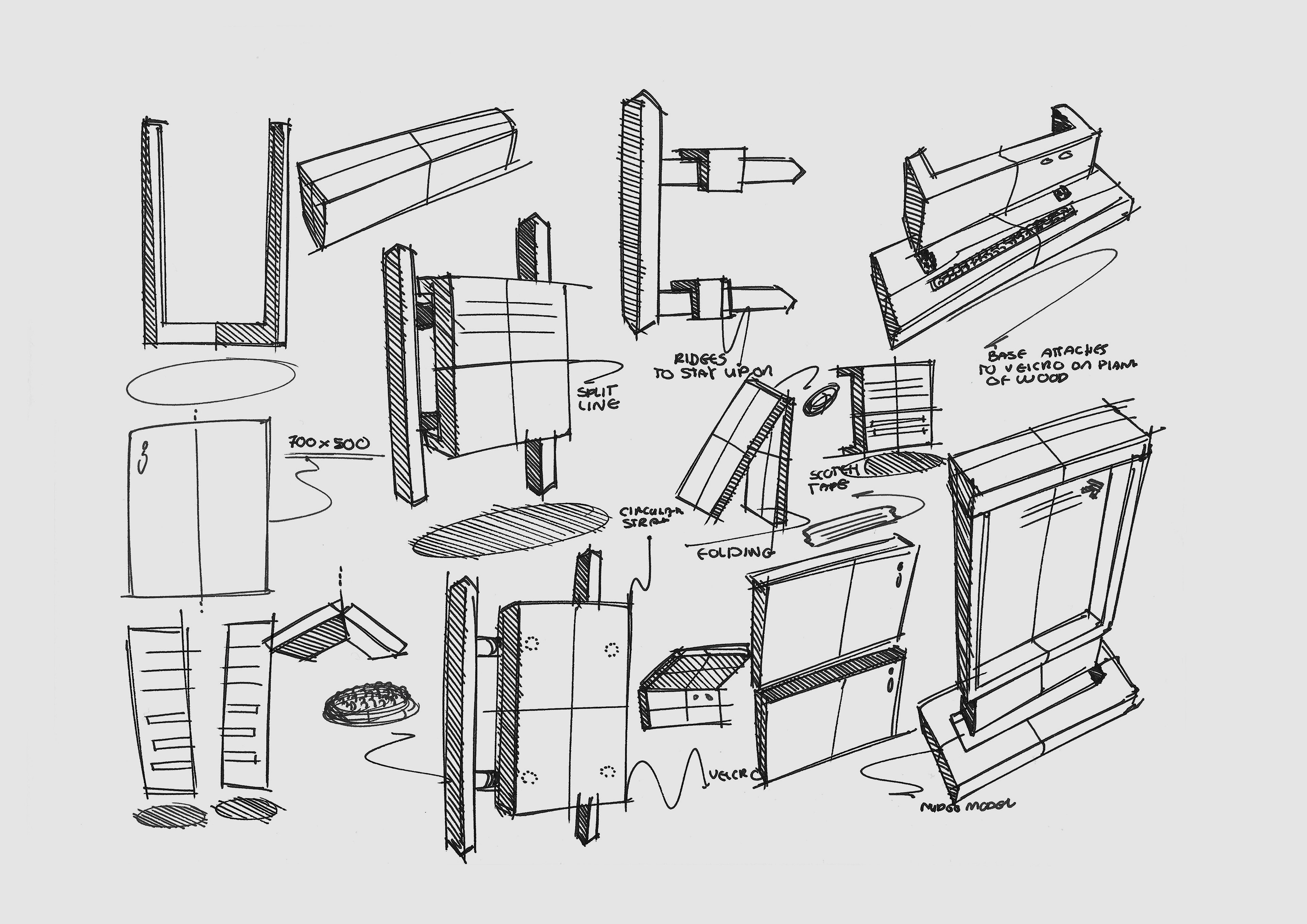
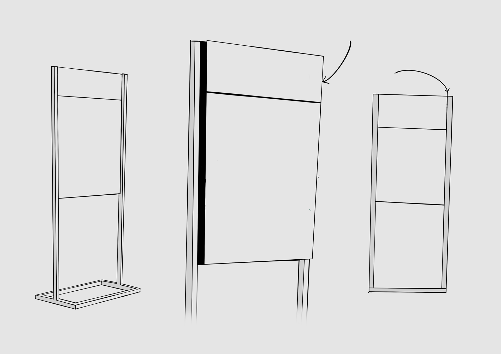
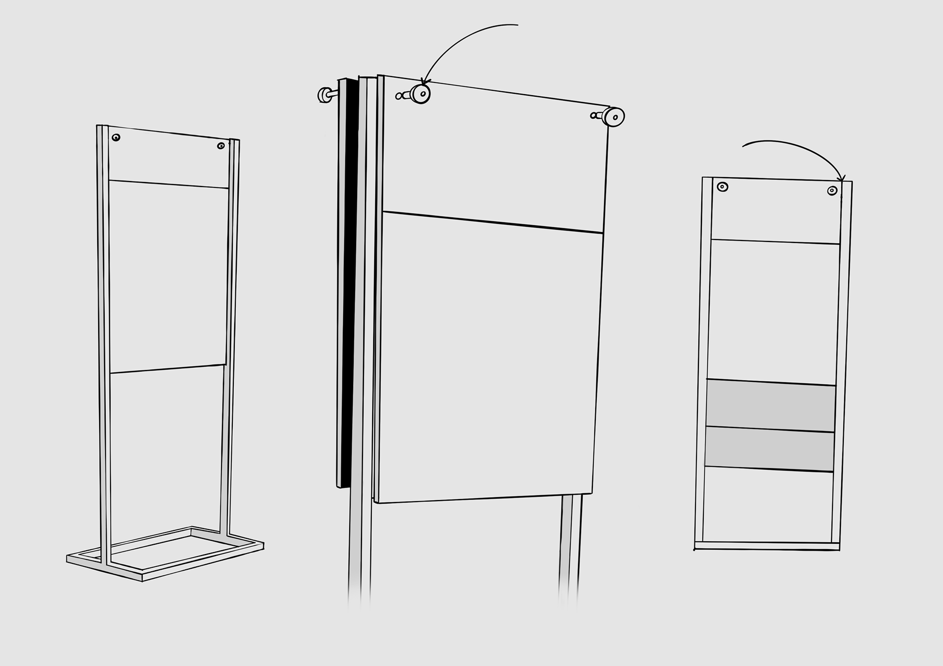
10. Information Updatability Concept Sketches.
Exploring through sketches how information can be conveniently updated on an interior freestanding sign, using various techniques such as a slide-on panel, hooks and screws.
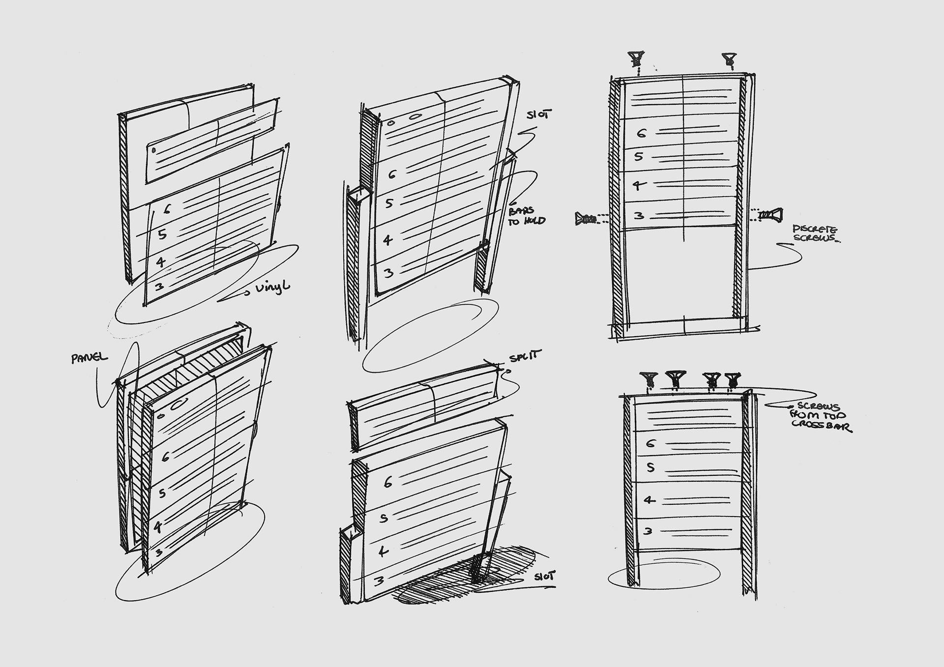
Early Exploration
Magnetic Attachment
Screw Attachment
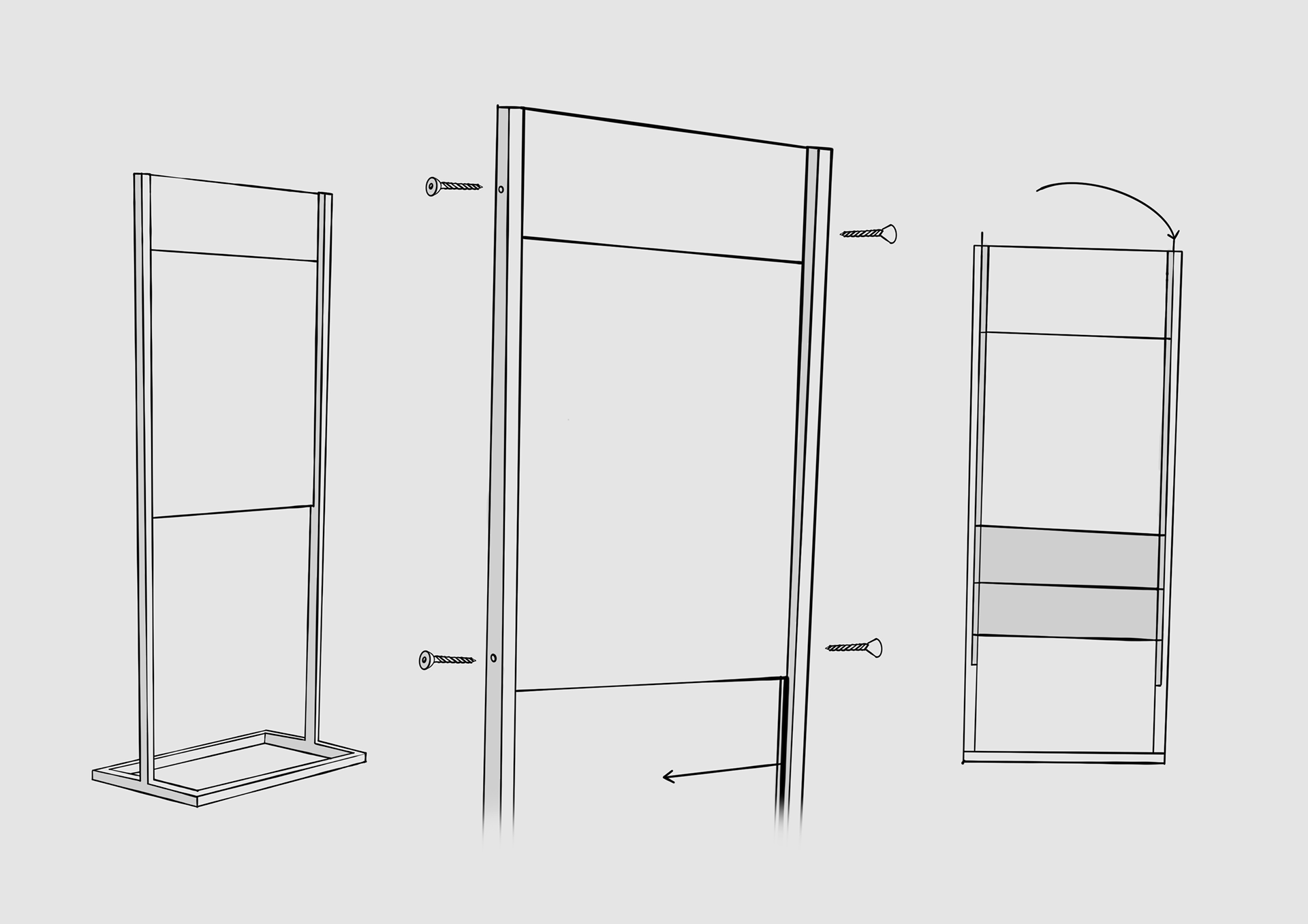
Side Screw Attachment
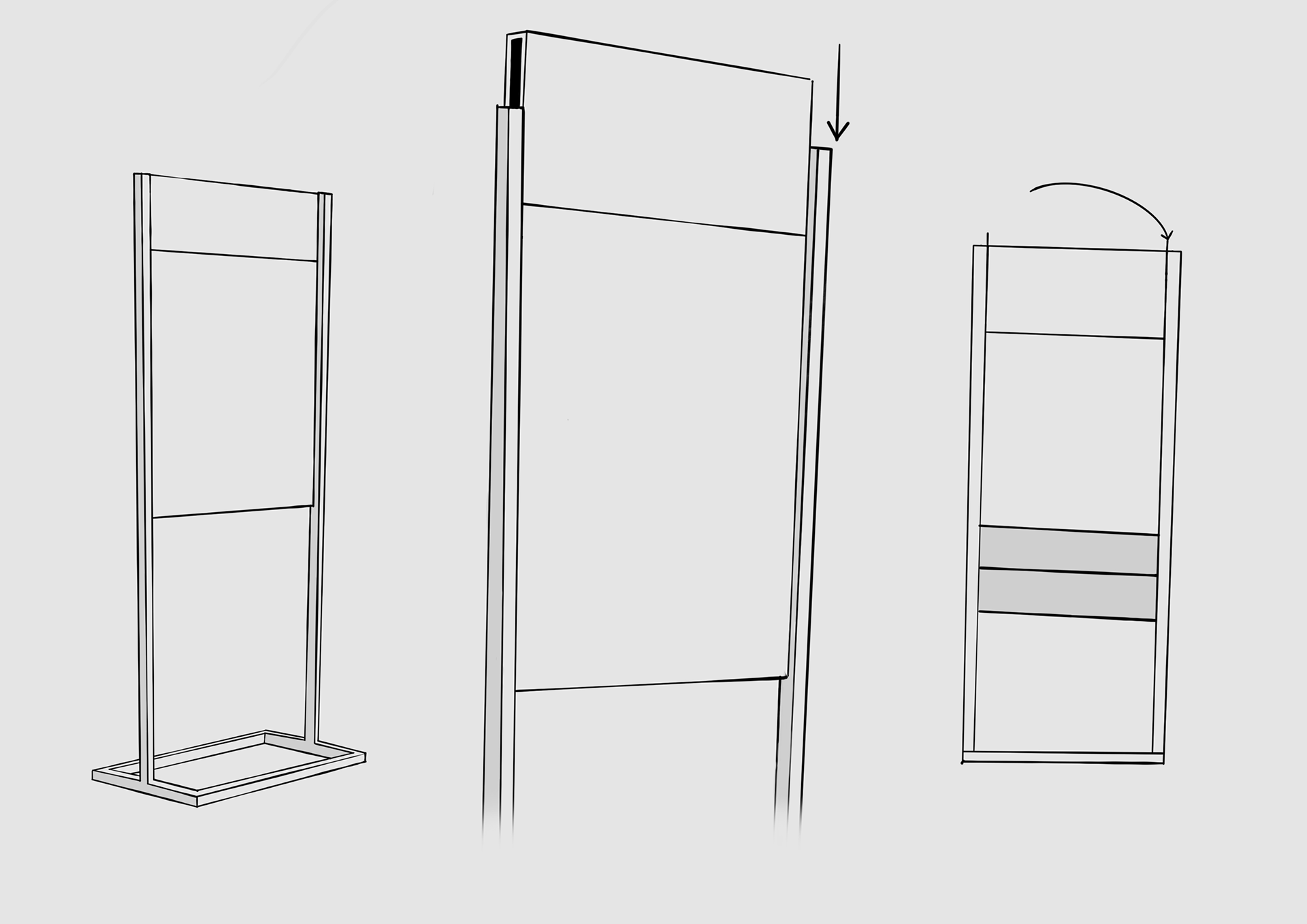
Sliding Panel Attachment
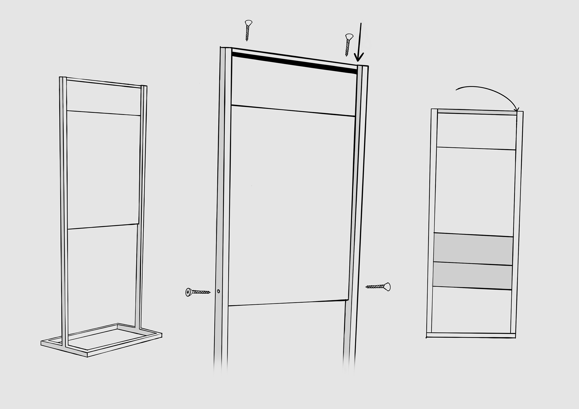
Crossbar Screw Attachment
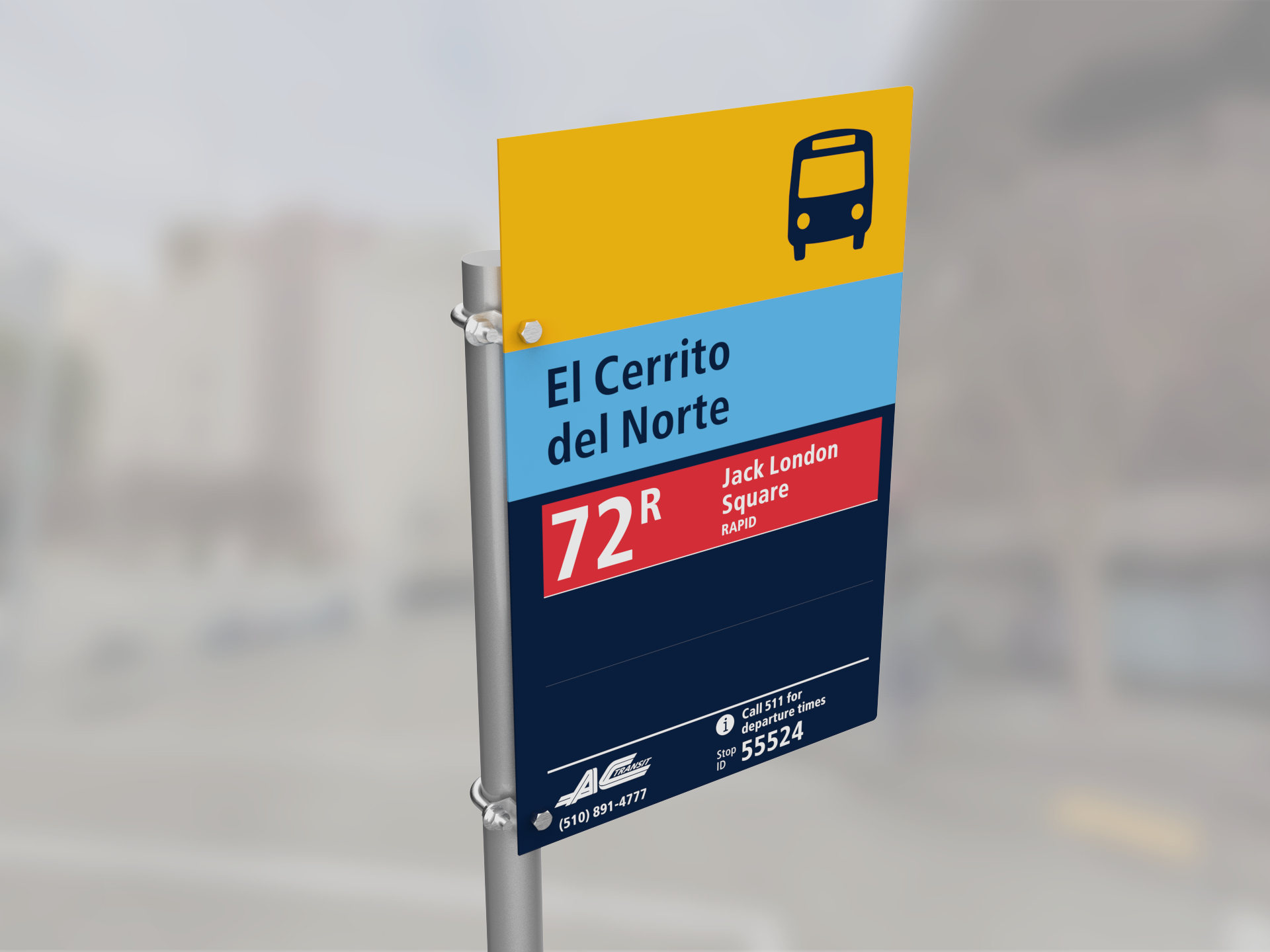
// [MTC] Metropolitan Transportation Commission.
Post Prototype Bus Stop Guide.
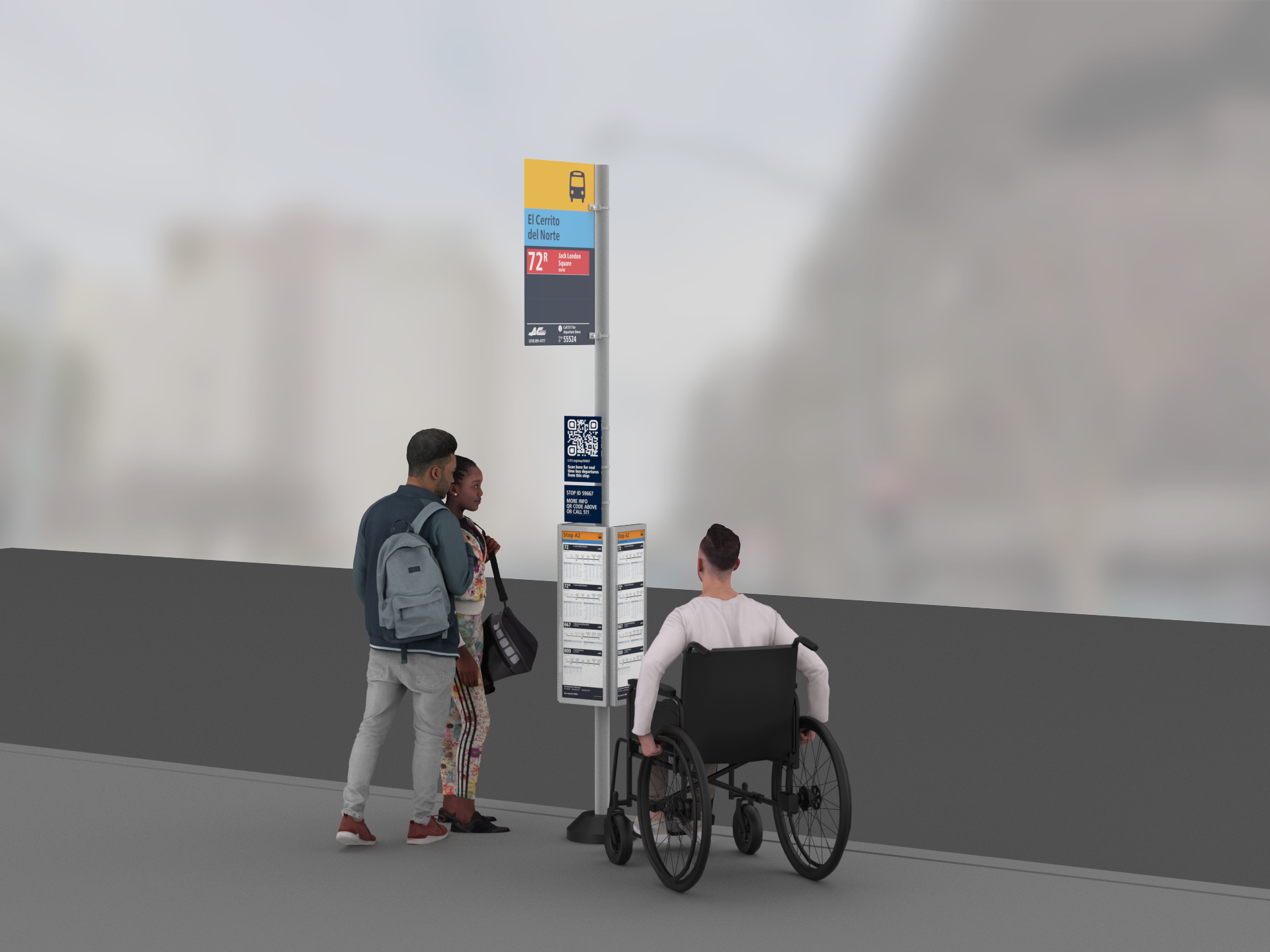
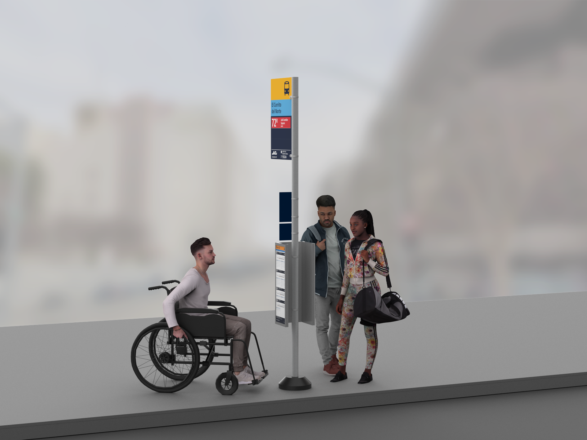
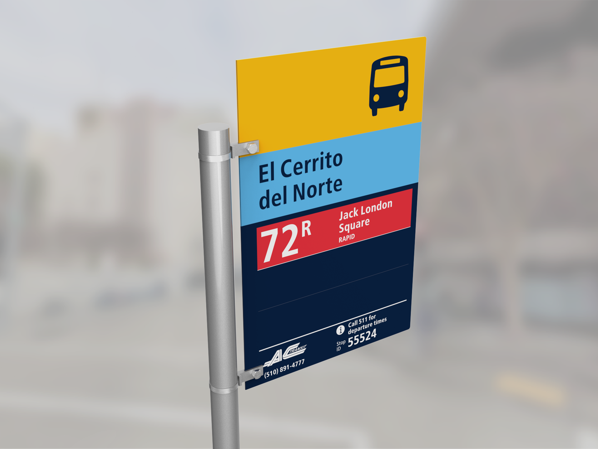
1. Bus Stop Guide Visualisations.
For a bus stop guide document for further implementation of the prototype signs, visuals were created to show various combinations of information panels for variable stop types. Pictured here is a triple schedule panel, and variations included single, double, transit centre and secondary bus stops.
Triple Schedule Panel Front-View
Triple Schedule Panel Back-View
Wing-Bracket Circular Attachment
2. Further Bracket Visualisations.
Exploration of post types (square & round) and two attachment methods (wing & u-shaped bracket).
U-Bracket Circular Attachment

U-Bracket Square Attachment

Wing-Bracket Square Attachment
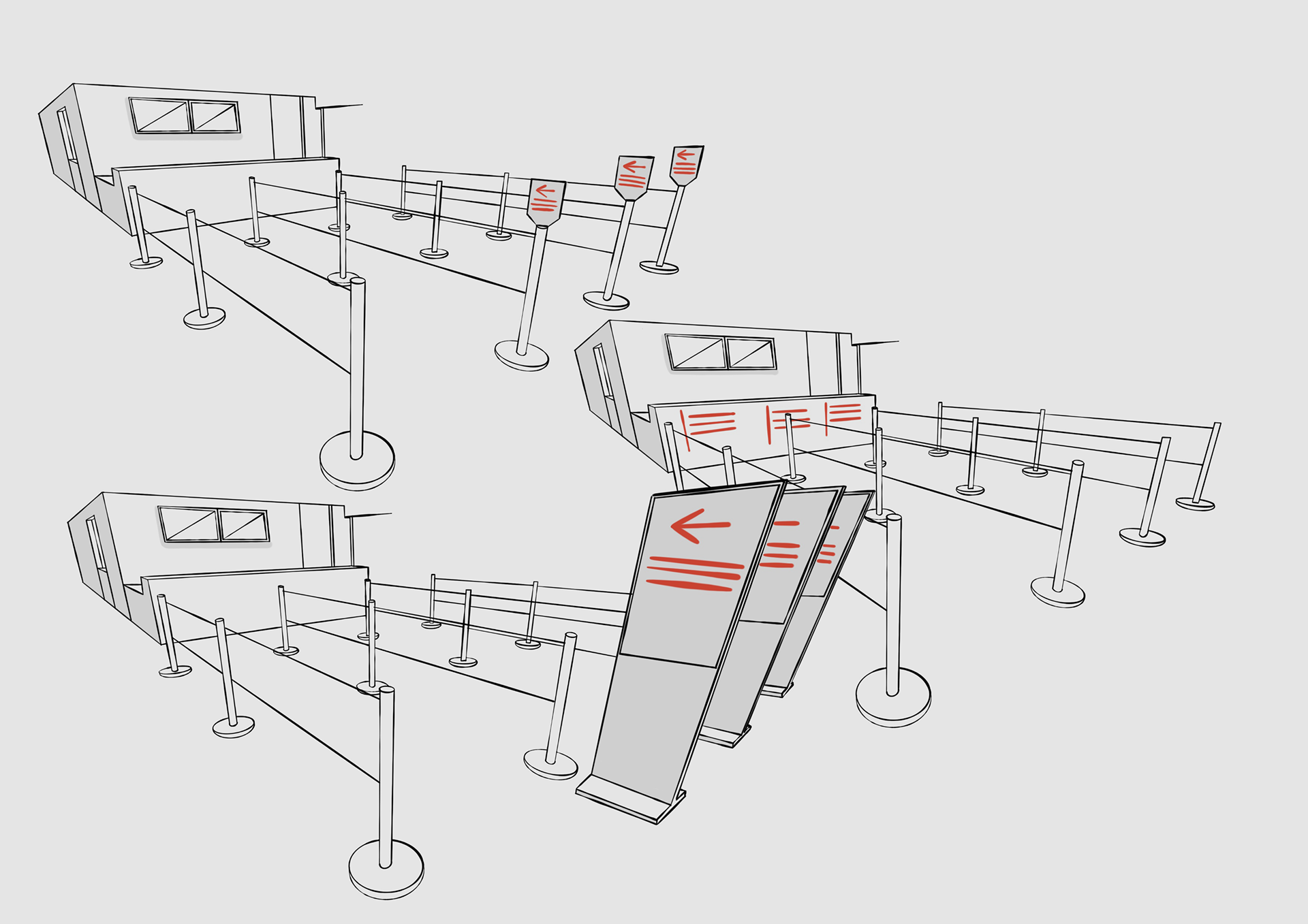
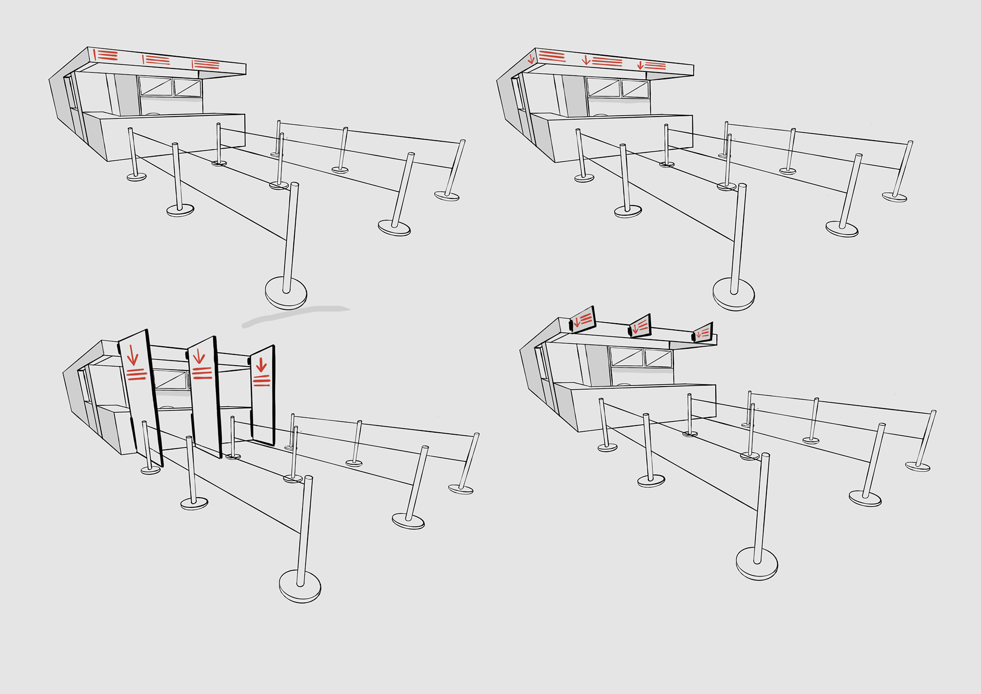
// [MFAH] Museum of Fine Arts Houston.
Beck Garage Lobby.
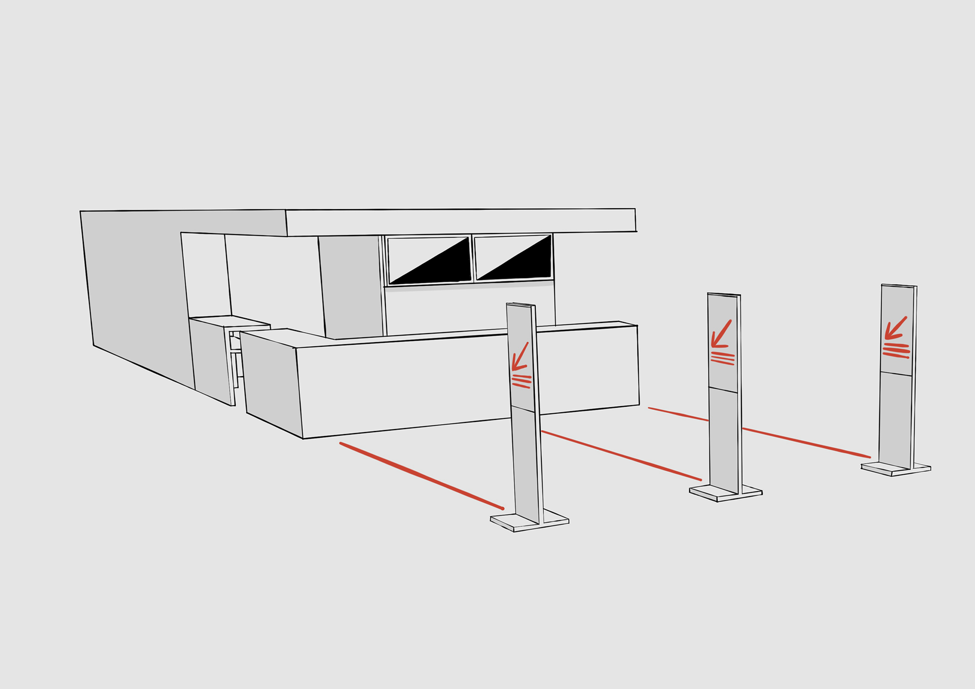
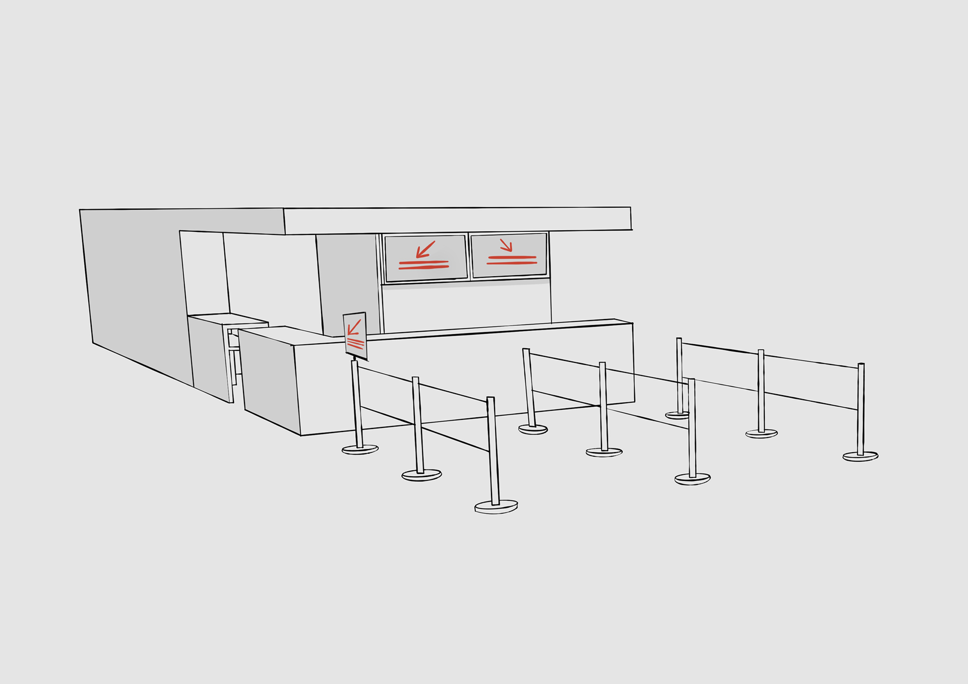
1. Initial Exploration.
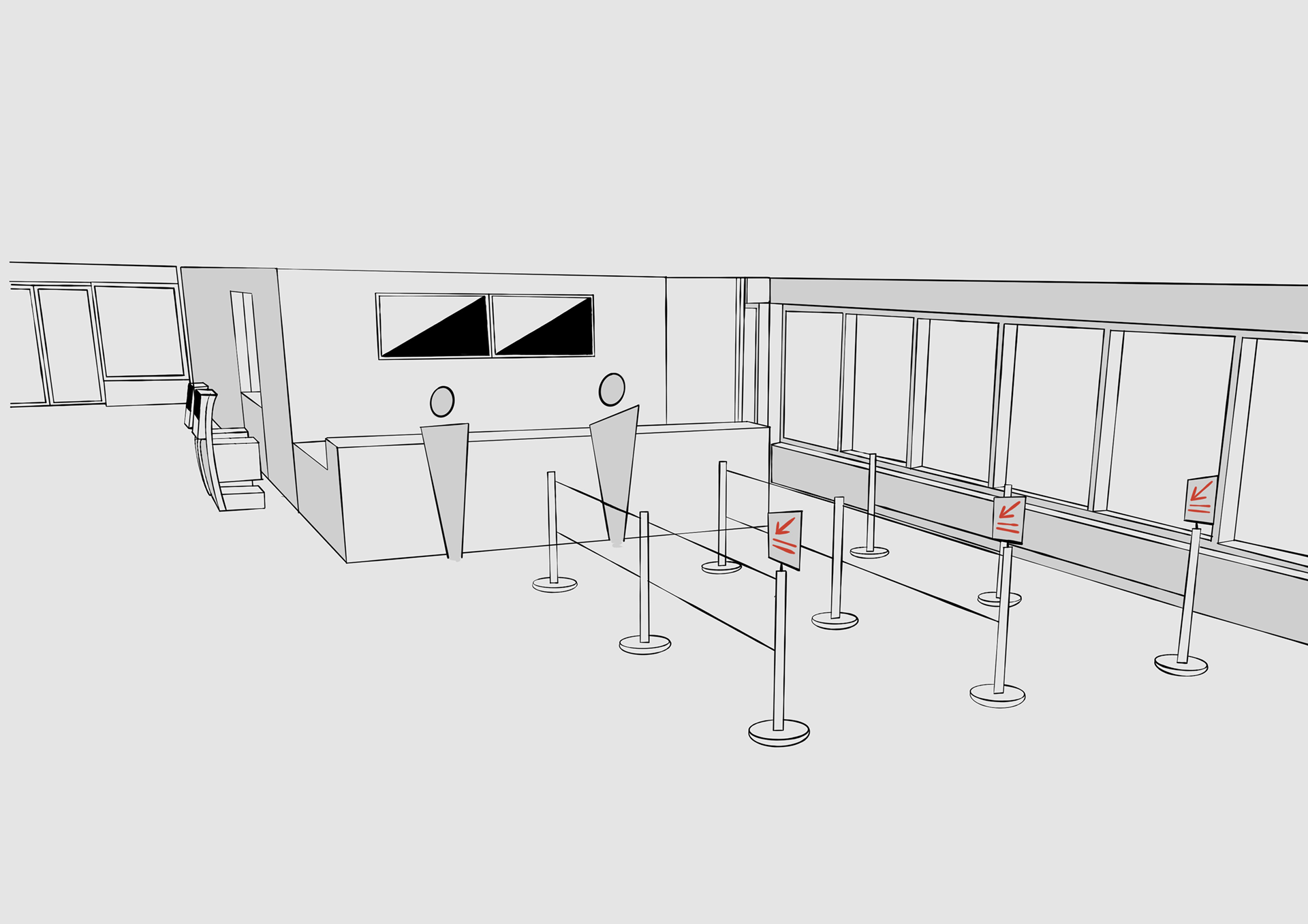
Three queues were to be created, two for visitors and one for members: exploration of postercases and various other signs was used in order to decide how best to layout the reception area.

2. Selected Ideation Sketches.
Few sketches from the ideation set, exploring how the queue for members could differ from visitors and how the signage should be placed in the space in order to convey the difference clearly.
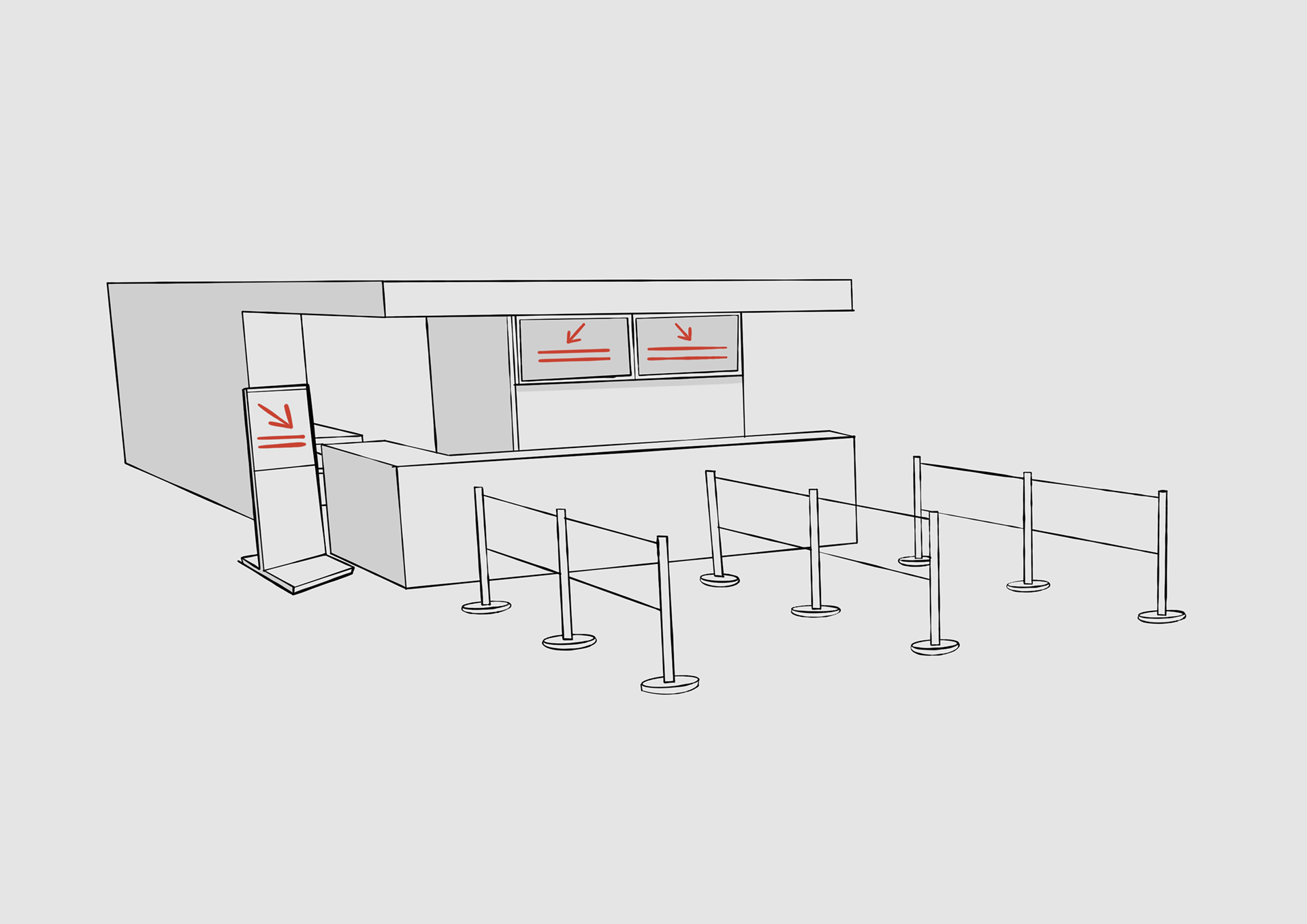


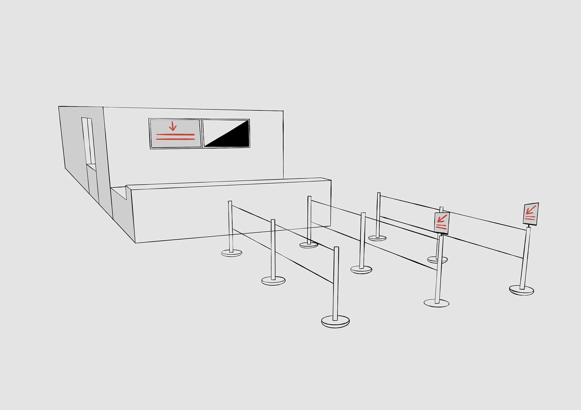
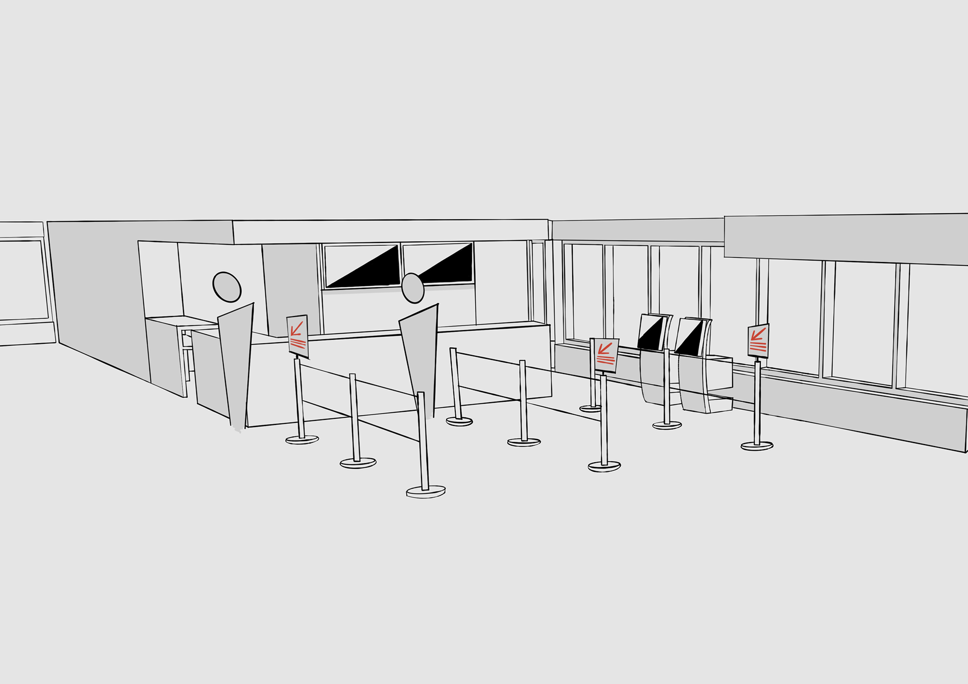
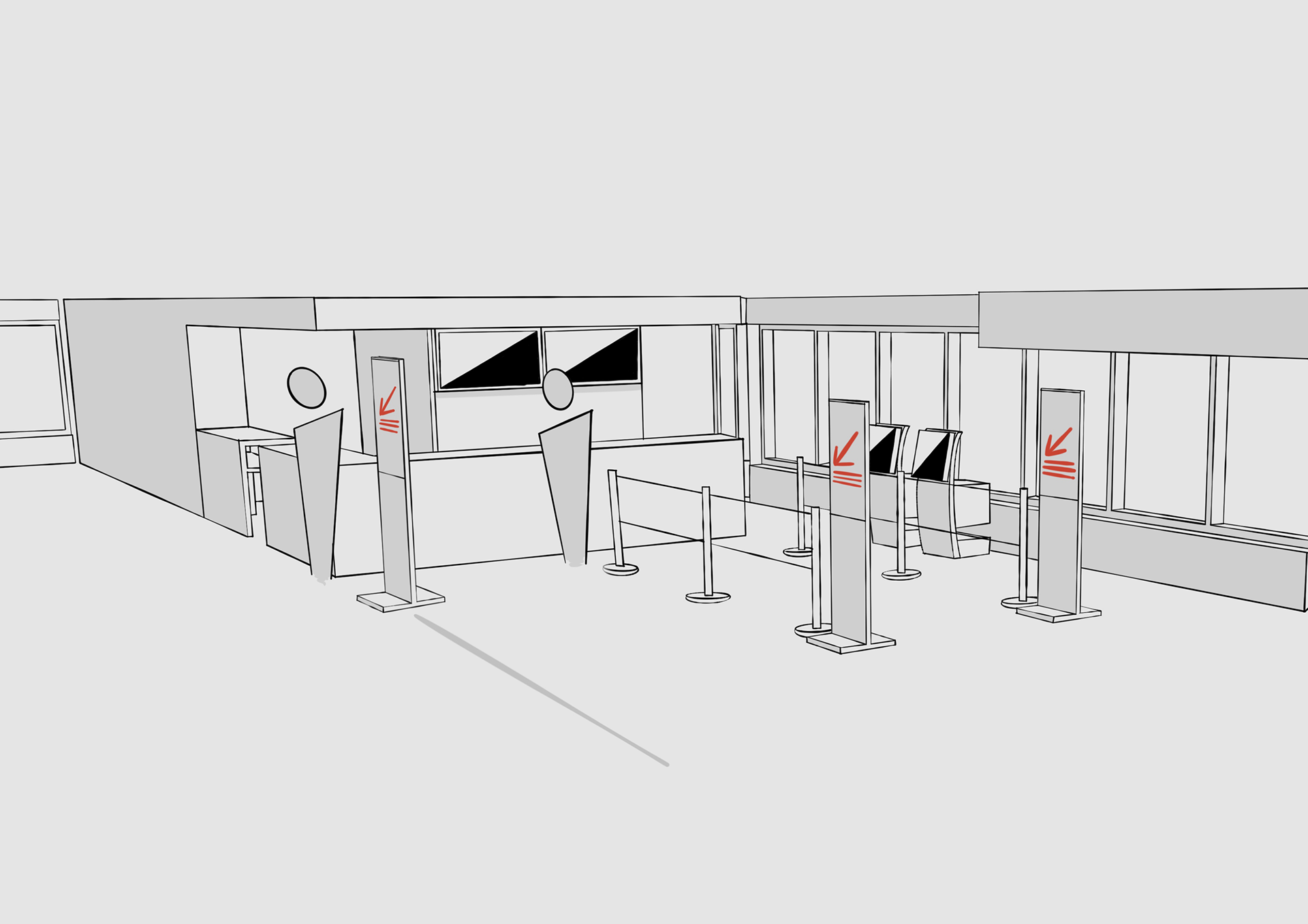
3. Shortlisted Designs.
Three shortlisted options which would go on to be developed further. These would allow clear communication of the queueing system.
// Princeton University [PU].
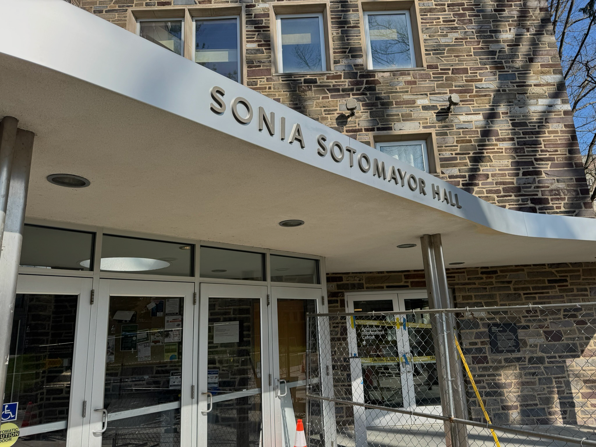
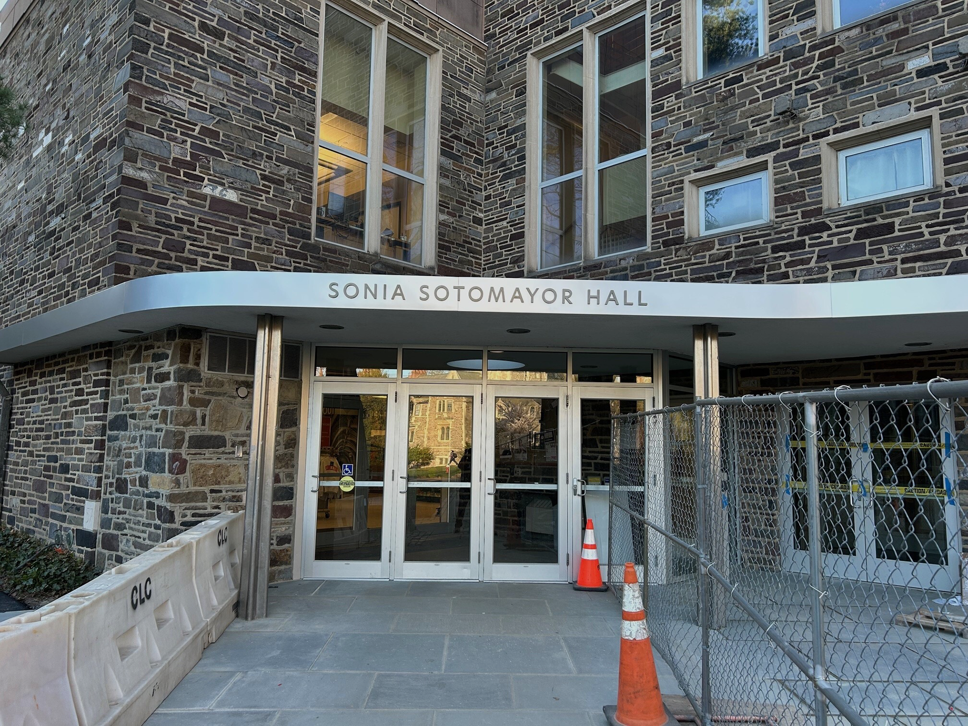
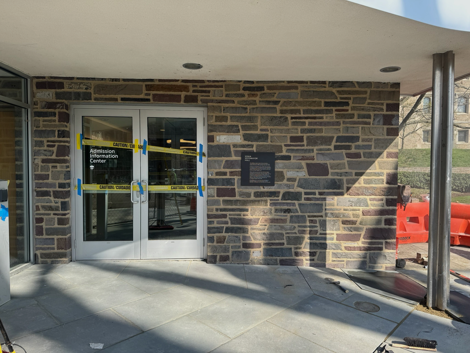
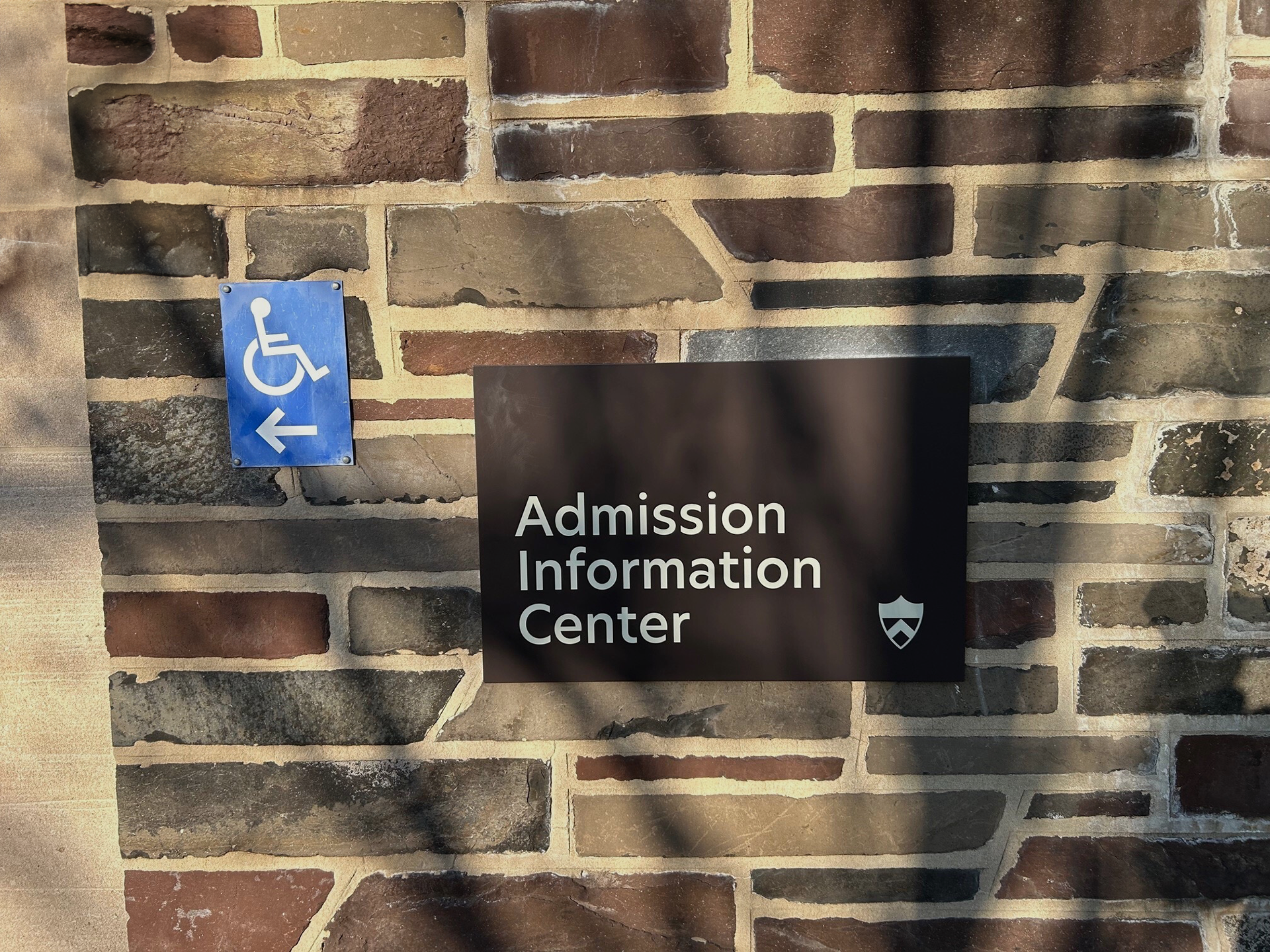
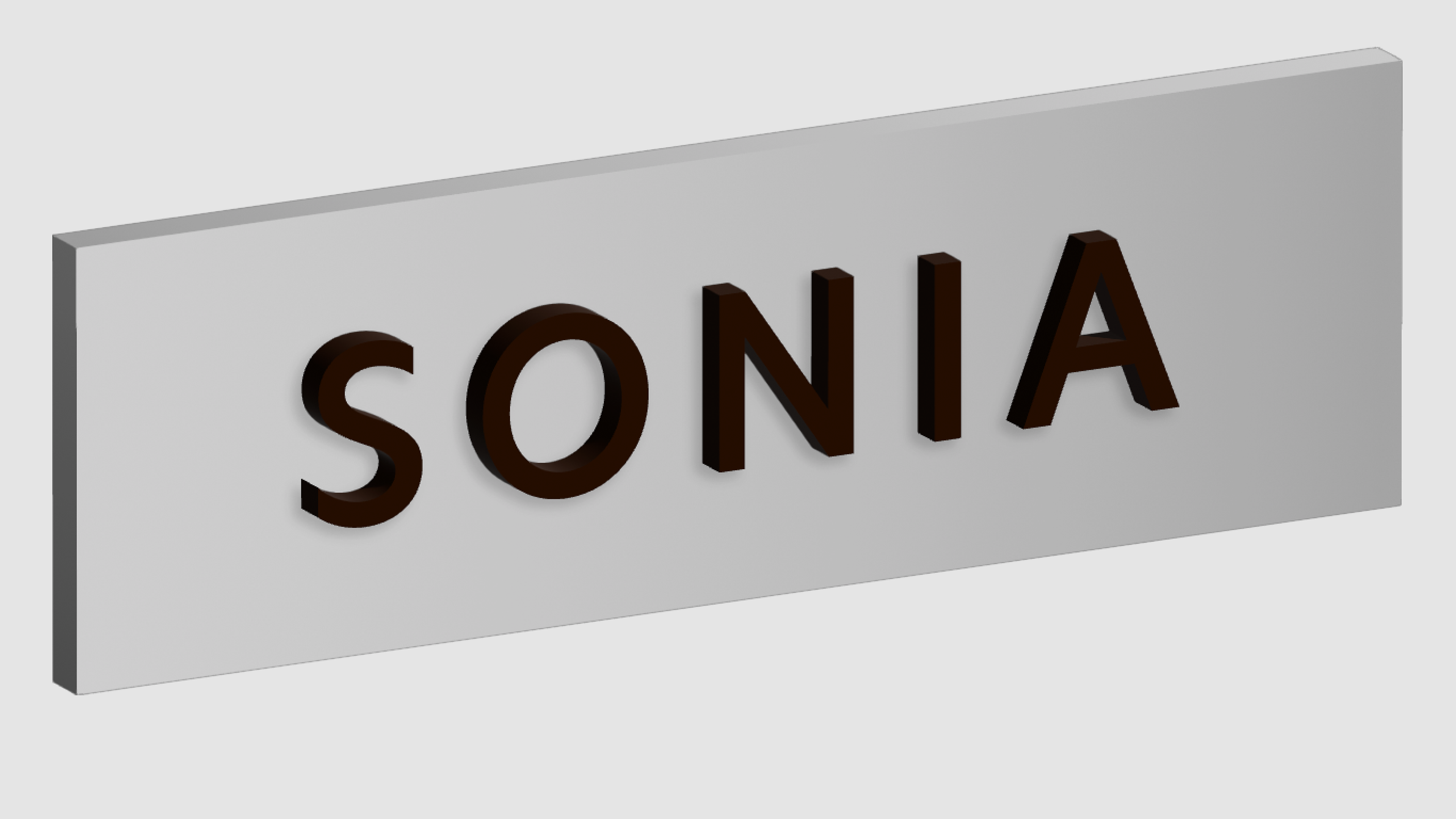
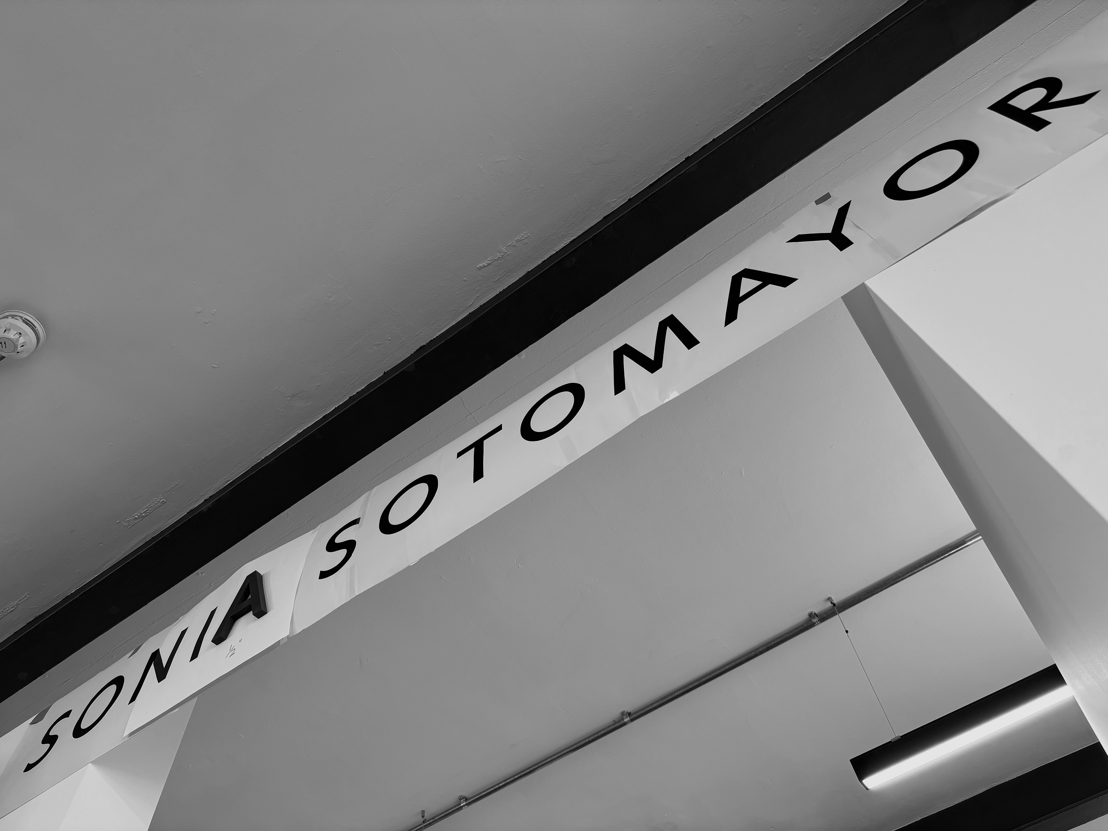
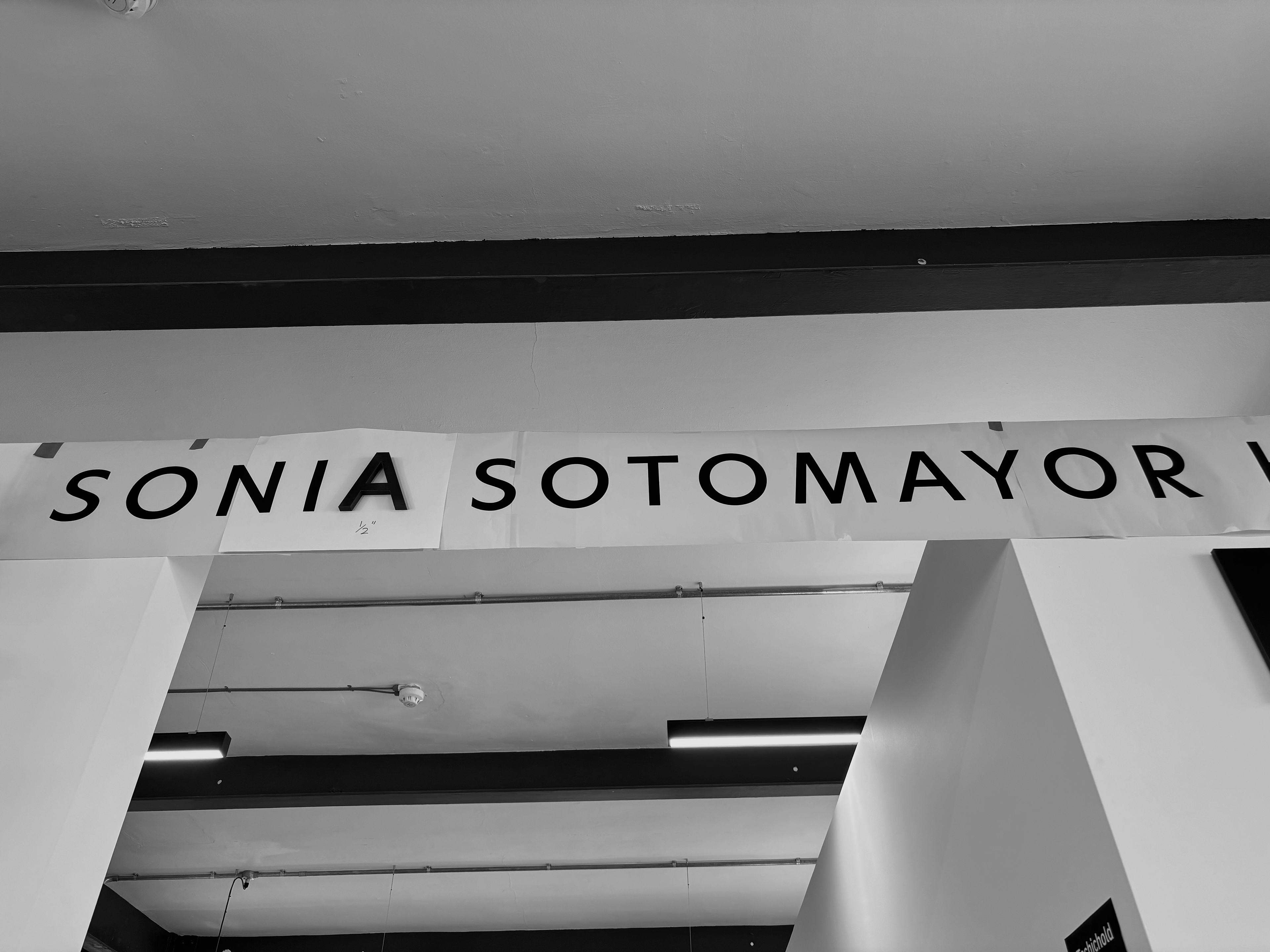
Sonia Sotomayor Hall.
1. Honouree Building Name Signage Visualisations.
Renders provided to Princeton University for the unveiling of the honouree building name: Sonia Sotomayor Hall.

University Place Render

Blair Walk Render
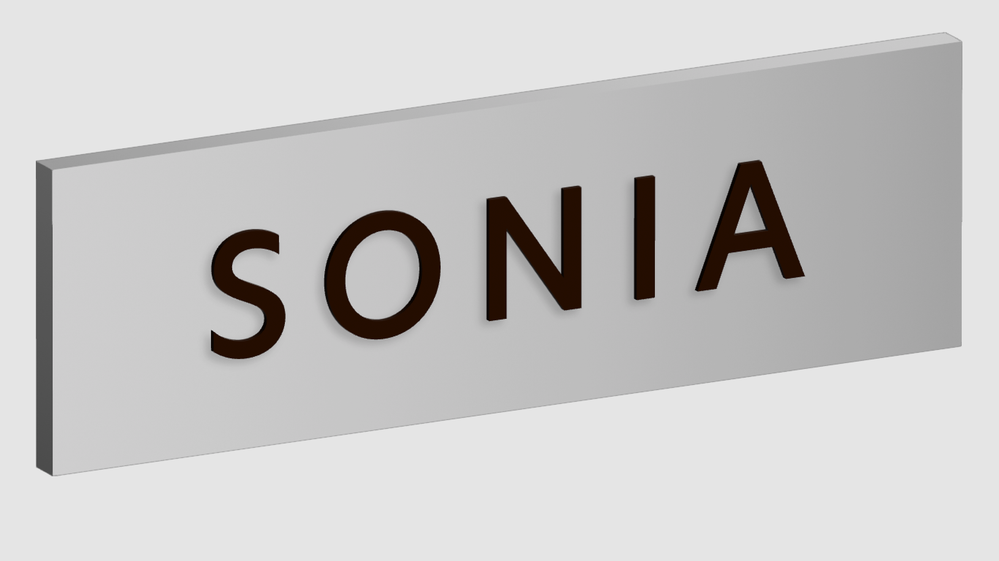
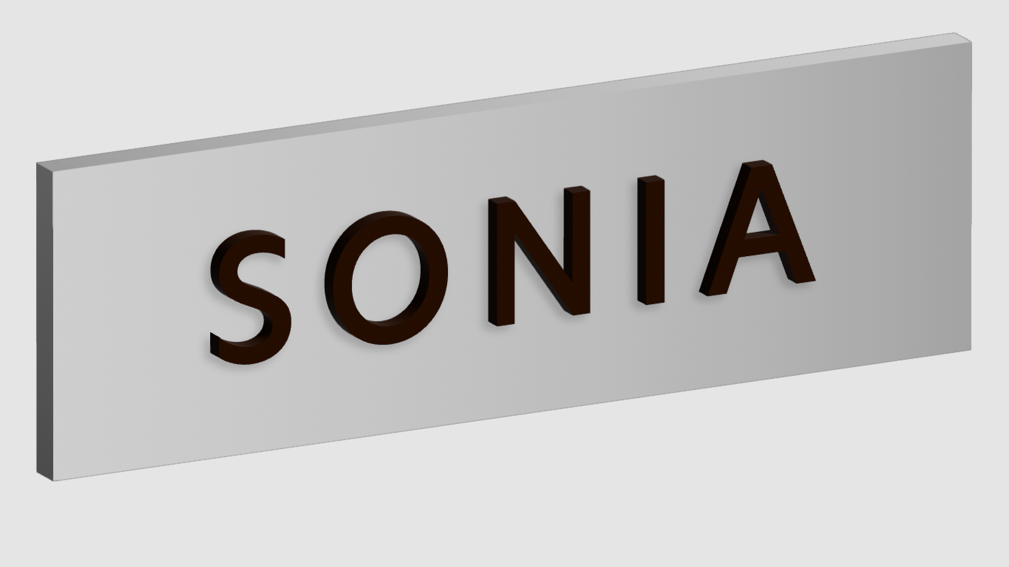
2. Letter Thickness Tests.
Attempting the Building ID in various thickness from ¼” to ⅝”, which allowed for the decision to be made on settling at a ½” thickness; this was then prototyped physically as well, in order to get a real world visual of the sign. The Facility ID (Admission Information Center) was initially given a ¼” depth, but this was changed to flat graphics because of manufacturing constraints.
1/4" Thickness

3/8" Thickness
1/2" Thickness
5/8" Thickness
Physical Prototype - 1/2" 3D Printed Model
Physical Prototype - Alternate View
3. Installed Signage.
The installed signage prototype (installed April 12) was designed for the unveiling, based upon this, the final prototype will go up afterwards with minor changes.